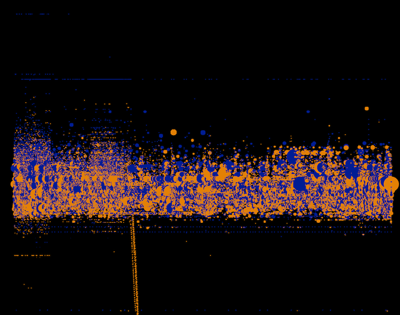
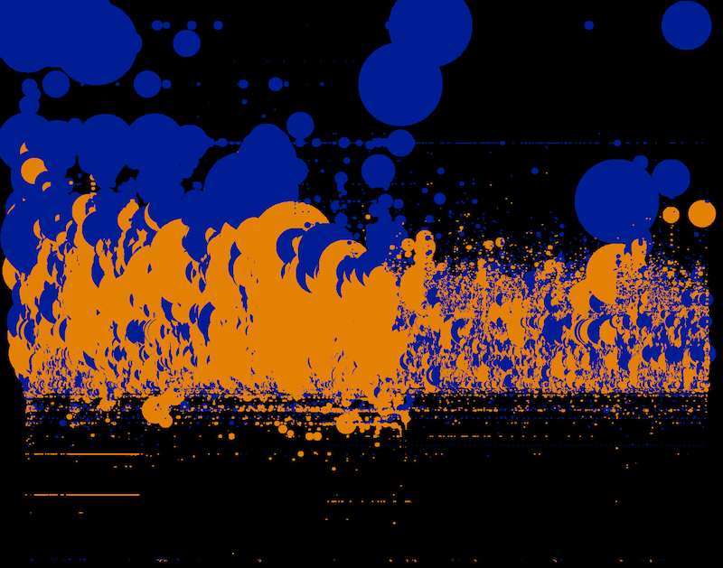
Design and technology studio Stamen visualized financial transactions of buy and sell data on NASDAQ during a single day.
What’s interesting about this visualization is the density of information that is captured within the dataset and the use of our pattern recognition capabilities to see repetitions and outliers of such a dense set of data.
http://content.stamen.com/visualizing_a_day_of_financial_transactions_on_nasdaq
http://content.stamen.com/visualizing_a_day_of_financial_transactions_on_nasdaq_part_2
For each transaction they mapped:
- time of the transaction, to the second
- whether it was buy or sell
- price of the transaction
- number of shares traded
Each image represents one minute in time and shows every trade that happens within the timeframe.
Each trade is shown as a circle:
- Every vertical row is a second in time. So the left hand side of the screen is the beginning of the minute, the middle of the screen is 15 seconds in, and the right hand side of the screen is the end of the minute, with 60 seconds in between.
- Blue dots are buys, yellow dots are sells
- The vertical axis is the price of the transaction; the top of the screen is cheaper stocks and the bottom is more expensive stocks.
- The size of the dot is the number of shares traded; small dots are for a few shares and larger dots are for a larger number of shares.
8:30-8:31 AM
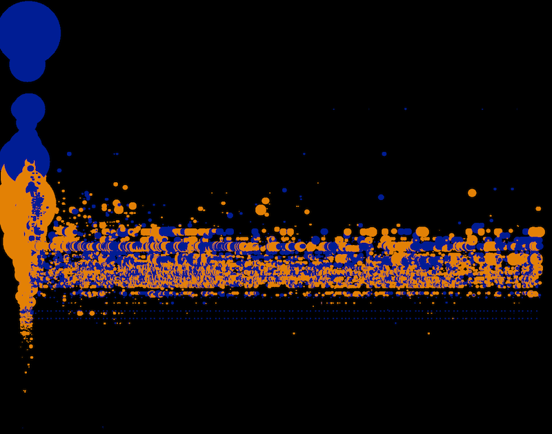 The images always show one minute of transaction. Bursts like this one at 8:30 become easily visible.
Before trading opens for the public a dense wave of small transactions happens.
9:30-9:31 AM
Opening of the public trade creates a massive burst of activity.
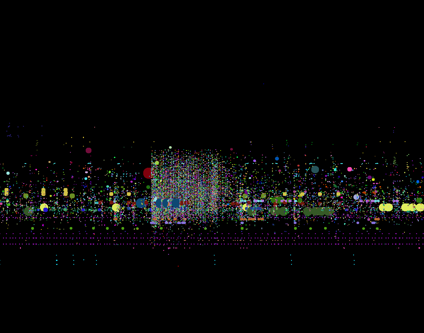
In these visualizations a unique color represents each trader:
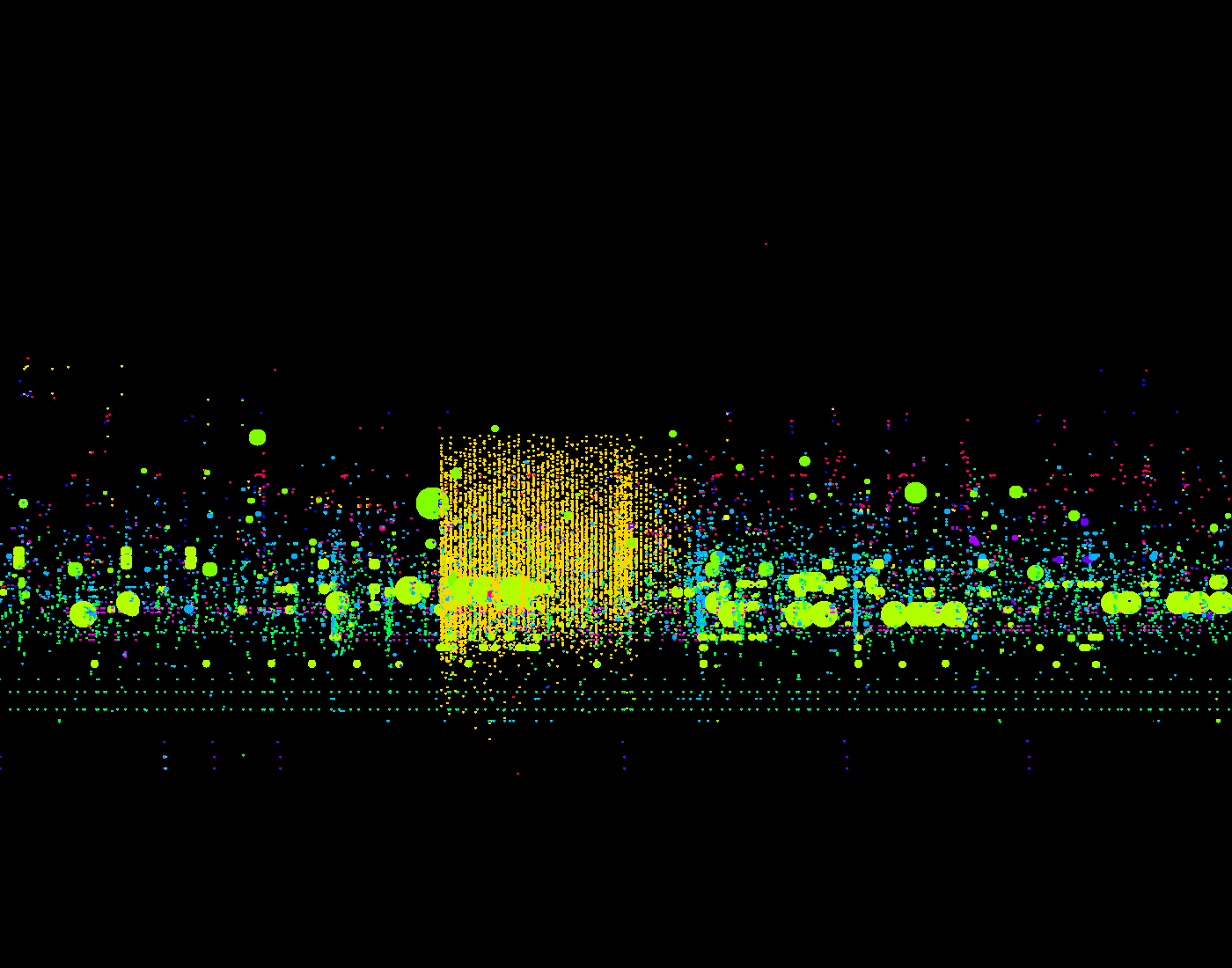 The orangish square above shows a single trader perform a burst of concentrated activity within precisely deliniated margins.
A unique color to represent each stock. The data is the same than in the image above. It becomes visible that the single trader trades a wide range of small stocks.

