Network traffic data becomes “big data” very quickly, given today’s transaction speeds and online data transfer volumes. Consequentially, we attended the Best in Big Data congress in Frankfurt/Main, to learn about big data approaches for our, but also for other domains. Most of the presntations seemed to be made by big companies to sell to other big companies. Business value of big data and how to deal with it in enterprise contexts consumed …
Monthly Archives: September 2013
IPython: interactive/self-documenting data analysis
IPython is an “interactive” framework for writing python code. Code snippets can be run at the programmer’s will and the output will be displayed right below the code. Together with rich input from html-markup to iFrames, an entire workflow can be fully documented. This is very handy for learning, of course, but also to make a complex analysis of a computer incident available and transparent to later readers. As everything (docu, code, output) gets “statically” …
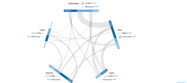
GED VIZ / Boris Müller & Raureif / Bertelsmann Foundation / 2013
GED VIZ is a HTML5 visualization of economic and demographic relations between countries as network relations. It is highly customizable through different datasets, all countries worldwide and based on a time line. The customized graphic can be exported and used externally. GED VIZ
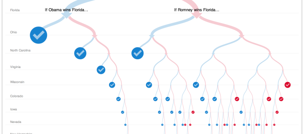
512 Paths to the White House / Mike Bostock / 2012
Mike Bostock and Shan Cartners 512 Paths to the White House shows all possible paths to victory to the two 2012 US Presidential candidates Mitt Romney and Barack Obama. 512 Paths to the White House
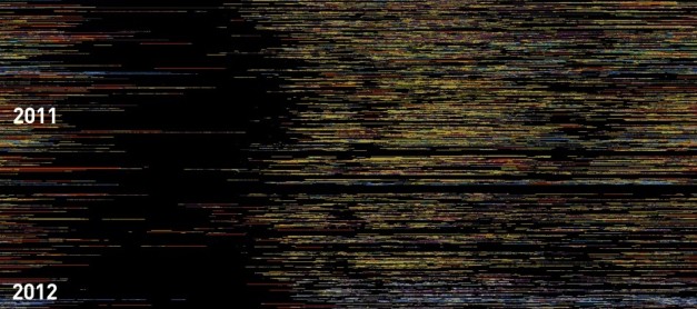
Every Day Of My Life / Marcin Ignac / 2010
Marcin Ignacs visualization „Every Day of My Life“ is a static poster visualizing his computer usage statistics from the last 2.5 years. Each line represents one day. Colored areas represent different applications while black represent that his computer was turned off. Through this his sleeping patterns, coffee breaks and sleepless nights in front of the computer become visible. Every Day Of My Life
Scatterplot Matrix / Mike Bostock / 2013
The scatterplot matrix visualizations from Mike Bostock match each row within the dataset against each other. By choosing a range within one matrix all selected data-points within each cell gets highlighted. Scatterplot Matrix
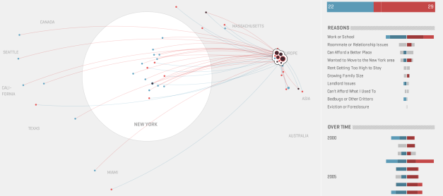
Map your moves / Moritz Stefaner / 2010
Map your moves represents more than 4.000 immigration and emigration patterns from over 1.700 people. Each circle represents one zip code in the area in New York the size represent moving from and moving to citizens. The colors represent people moving into the city in red and people moving out of New York in blue. Map your moves

