18 articles Articles posted in Visualizations

Time Series Visualizations – An overview

“Time-series — sets of values changing over time”
A Tour Through the Visualization Zoo 
http://hci.stanford.edu/jheer/files/zoo/

This description of the word “Time-Series” is very close to the explanation in Oxfords dictionary which adds that the word comes from a statistic background and often the intervals are equal within the time-series.
http://www.oxforddictionaries.com/definition/english/time-series?q=time-series

Within our research project we are mainly interested in the visualization part within the vast field of statistics. In the book “The Visual Display of Quantitative Information” Edward Tufte defines time-series visualizations as:

“With one dimension marching along to the regular rhythm of seconds, minutes, hours, days, weeks, months, years, centuries, or millennia, the natural ordering of the time scale gives this design a strength and efficiency of interpretation found in no other graphic arrangement.” 
Edward R. Tufte
The Visual Display of Quantitative Information
p. 28

Classical datasets of time series visualizations are temperature, wind, condensation (or any other kind of weather measurement), stock data, population change, electricity usage etc. the field is so vast that Tufte writes that in a study that analysed graphics between 1974 and 1980 75% of the graphics where time-series visualizations. Obviously more than 30 years later the field has changed but time-series still seams to be an important part within the area.

In my opinion most Security Network Data doesn’t provide information with changing values over time initially. For example Flow Data is structured through nodes and edges with additional information. These single incidents in time don’t hold the same characteristics as usual time-series datasets where one value changes. But on a certain level of abstraction (for example by counting incidents within set timeframes) or by combining time-series with other methods like network visualizations this kind of graphics could be very helpful for us.

This article first summarises a few classical time-series examples and than looks at recent developments in the field.

The first time-series visualization was designed in the tenth or possibly eleventh century. It shows the changing positions of the planets with the time on the x-axis.

As we will see the use of the x-axis is still the most common form of presenting time-series graphics. Nathan Yau gives an overview of the most common forms of time-series visualizations in his book “data points” which are in his opinion bar graphs, line charts, dot plots & dot-bar graphs. All of this charts are actually similar in what they do. The only difference is the graphical representation of the data. While all of them use the time dimension on the x-axis, Nathan Yau gives two examples for different representation methods. Radial plots, which are similar to line charts, just circular and calendar heat maps.

Jeffrey Heer, Michael Bostock, and Vadim Ogievetsky from Stanford University are giving a different overview of time-series visualizations in their article “A Tour Through the Visualization Zoo”. Their overview starts with index charts, which is an interactive line chart.

Index Chart

Stacked Graphs. Which are Area Charts that are stacked on top of each other. They are also called stream graphs. What makes them special is the fact that we get a visual summation of all time-series values.

The controversy around stacked graphs is very big. Alberto Cairo, graphics director at El Mundo Online wrote in a blog article that stacked graphs are “one of the worst graphics the New York Times have published – ever!” on the other hand the publisher of the first paper on stacked graphs wrote: “simplifying the user’s task of tracking individual themes through time by providing a continuous ‘flow’ from one time point to the next”. Furthermore, “we believe this metaphor is familiar and easy to understand and that it requires little cognitive effort to interpret the visualization” both points seam valid to me the cognitive effort needed in some contemporary visualizations is so high that it becomes hard to understand them without putting a lot of effort into them. Stacked Graphs are very simple to understand for the complexity they hold but the information output that can be generated from them is questionable. Andy Kirk from visualisingdata.com credits both sides very fairly in his blog article about the graphs with these comments:

“… a streamgraph is a fantastic solution to displaying large data sets to a mass audience.”

“The main problem facing static streamgraphs lies in the difficulty of reading data points formed by uncommon shapes.”

Tools: D3, Processing

Paper: ThemeRiver: Visualizing Theme Changes over Time,

Stacked Graphs – Geometry & Aesthetics

Example: The Ebb and Flow of MoviesHow Different Groups Spend Their Day, Trace (this one is about visualizing wireless networks)


Stacked Graph

Small Multiples are multiple time-series graphs (what kind these graphs are is another question, in this case, area charts) arranged within a grid. Small multiples are more use full to understand different datasets on its own and not as a summary apposed to the stacked graphs.

Small Multiples

The last example from the article are horizon graphs. These are actual also area charts which are mirrored and separated by occupacity. This is especially interesting in combination with small multiples because the “data density” is much higher than which classic area charts which leads to more information in a smaller space. An important factor when we are dealing with big datasets.

Horizon Graph

There is some interesting research about the usefulness of horizon graphs that I recommend: ToolPaperArticle


The list of graphics from the Stanford Group are much more contemporary than the examples from Nathan Yau, but still all of these examples use the same mechanism to visualize time-series data by using one axis as a dimension for time. This now more than 1.000 years old way to visualize time is helpful and very common but might not always be the best choice. As we know from scatter-plot visualizations our two space dimensions within a graphic are maybe the most powerful ones for pattern recognition and time might not be the main factor to identify these patterns. So what other ways are there to use time as a dimension within a visualization a part from space?

Animation:
At least since Hans Roslings famous TED talks the usage of animation for displaying time is common and it seams to be the most obvious way to visualize time very literal though time. But the technique needs to be used with caution.
Tamara Munzners visualization principles give a great insight on page 59 why visualizing time with animation is dangerous:

Principle: external cognition vs. internal memory

  • easy to compare by moving eyes between side-by-side views –harder to compare visible item to memory of what you saw

Implications for animation

  • great for choreographed storytelling
  • great for transitions between two states
  • poor for many states with changes everywhere

There is also a paper about the topic which gives more insights into the problem.

Small multiples:
I already mentioned small multiples above but as I raised before the idea behind small multiples is more of a frame for visualizations than an actual kind of visualization. Like this we can also use each multiple as a timeframe. A beautiful example of small multiples with time as a dimension comes from the NYTimes Graphics department.

Binning time in bubbles:
The idea here is to use bubble charts where the time dimension gets binned by minutes, days, years etc. into one bubble and compared to each other. In the Nasdaq 100 Index example each year is represented by one bubble.

Scatterplots:
Scatterplots where time is displayed as connected points against two variables. This is similar to the animation idea. But in this case the animated dots leave behind a path behind. Also here the NYTimes has a good example.

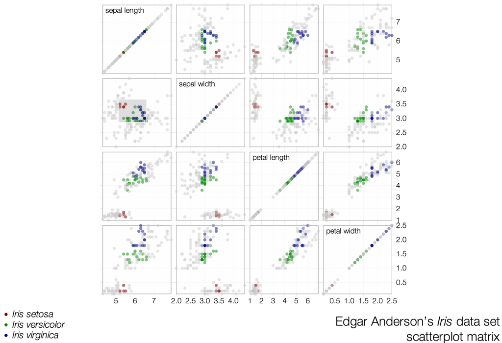
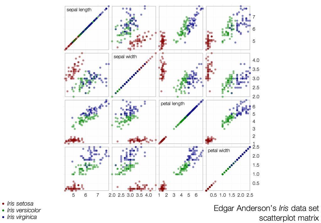
Scatterplot Matrix / Mike Bostock / 2013

The scatterplot matrix visualizations from Mike Bostock match each row within the dataset against each other. By choosing a range within one matrix all selected data-points within each cell gets highlighted.

Scatterplot Matrix


Screen Shot 2013-08-08 at 2.42.10 PM Screen Shot 2013-08-08 at 2.41.46 PM


Map your moves / Moritz Stefaner / 2010

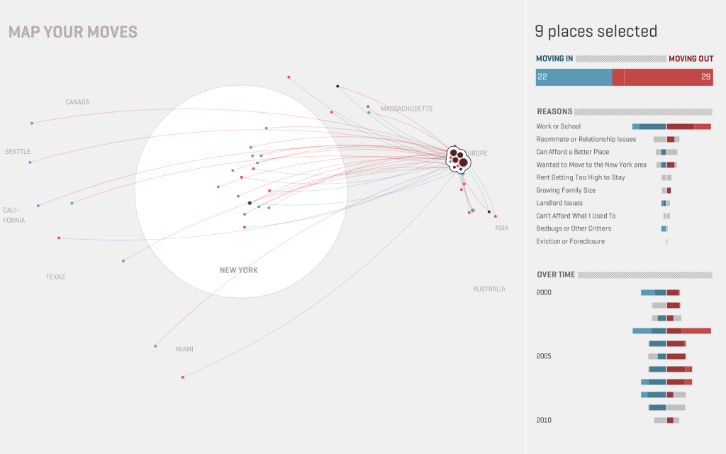
Map your moves represents more than 4.000 immigration and emigration patterns from over 1.700 people. Each circle represents one zip code in the area in New York the size represent moving from and moving to citizens. The colors represent people moving into the city in red and people moving out of New York in blue.

Map your moves

Screen Shot 2013-08-15 at 4.40.33 PM Screen Shot 2013-08-15 at 4.40.22 PM

Code Red Visualisations

Code Red was a computer worm observed on the internet in July 2001. On the 12th of the month the malware program began to replicated itself to spread to other computers through networks of Microsoft’s IIS web-server. Once a system got attacked the worm checked the system clock of the machine, if the date was between the 1st and the 19th of the month code red generated a random list of IP addresses from a static seed and infected the machines of those IP addresses. From the 20th to the 28th of the month the worm started a Denial-of-Service attack against the website whitehouse.gov. Through a research project at the Interaction Design Laboratories at the University of Applied Sciences Potsdam we tried to find different visualization formats to develop a better understanding of the worm.

Autonomous System Network

Visualisation of 15.000 attacked Autonomous Systems and their connections to each other during the Code Red epidemic. The connectivity of the links is represented by their colour and size. Magenta nodes are only rawly connected. Blue nodes are highly connected autonomous systems also called “hubs”. The connectedness of a node is measured in degrees, how many links do refer and go out from each node. The most attacked node is a not too well connected system within the network, an AS from the Korean Telecom which received 13.835 attacks. It is coloured green within the network. The two most connected nodes are UUNET which was one of the largest Internet providers in the United States it got attacked 10.767 times. And the most connected link toplink GmbH a german VoIP provider which only got attacked 34 times. In many network systems like cells or diseases epidemics spread through the hubs of a system and by doing so also affect those the most. In the chase of code red this can’t be said.

Attacks Radial

All attacks mapped by time and their location in latitude and longitude on a radial layout. Each point represents one attack and the time when it got attacked. The nodes are coloured in by the length of the attack, from red if the system was only attacked for seconds up to 30 hours in blue. All countries with more than 4.000 attacks are mapped around the radial layout by their longitude.

Attacks Timeline

All attacks mapped by time and Autonomous system. The same dataset as the Attacks-Radial-Lat-Lon-Time this time not radial but on a coordinate system. What’s interesting here are the different interpretations we can make from the two datasets. While it becomes clear were the attacks go in the radial version, in this version the anomalies at 17h become much more clearer as well as the abrupt end of the worm after 24h.

Autonomous System Hiveplot

Actually this graphic is not really readable and there are other forms to visualize Autonomous Systems Networks that are more helpful. But in two instances the structuring of the nodes can help to develop an understanding of the network. First it shows how much bigger the two biggest nodes are in the network compared to the rest and it shows the long tail there are a large amount of nodes with only one connection and very little nodes with more than that. This kind of network is very easy to attack and epidemics can spread very quickly.

Visualizing a day of financial transactions on NASDAQ

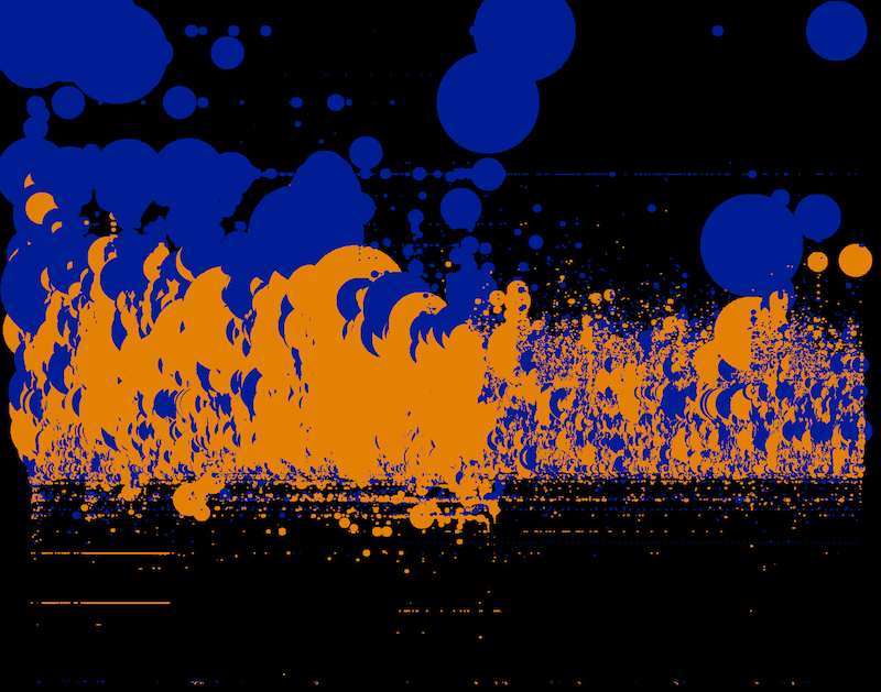
Design and technology studio Stamen visualized financial transactions of buy and sell data on NASDAQ during a single day.

What’s interesting about this visualization is the density of information that is captured within the dataset and the use of our pattern recognition capabilities to see repetitions and outliers of such a dense set of data.

http://content.stamen.com/visualizing_a_day_of_financial_transactions_on_nasdaq

http://content.stamen.com/visualizing_a_day_of_financial_transactions_on_nasdaq_part_2

For each transaction they mapped:

  • time of the transaction, to the second
  • whether it was buy or sell
  • price of the transaction
  • number of shares traded

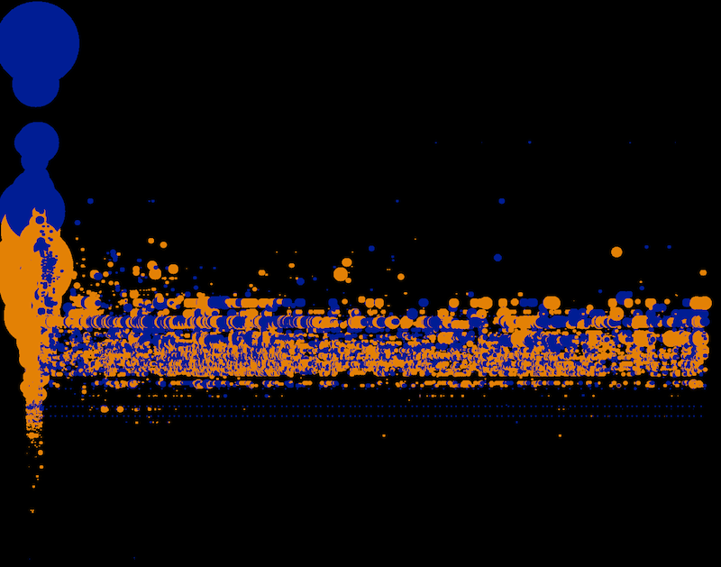
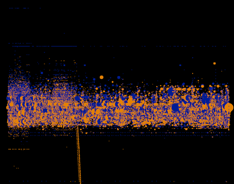
Each image represents one minute in time and shows every trade that happens within the timeframe.

Each trade is shown as a circle:

  • Every vertical row is a second in time. So the left hand side of the screen is the beginning of the minute, the middle of the screen is 15 seconds in, and the right hand side of the screen is the end of the minute, with 60 seconds in between.
  • Blue dots are buys, yellow dots are sells
  • The vertical axis is the price of the transaction; the top of the screen is cheaper stocks and the bottom is more expensive stocks.
  • The size of the dot is the number of shares traded; small dots are for a few shares and larger dots are for a larger number of shares.

8:30-8:31 AM
log_minute_60_smThe images always show one minute of transaction. Bursts like this one at 8:30 become easily visible.


9:29-9:30 AM
log_minute_149_sm

Before trading opens for the public a dense wave of small transactions happens.


9:30-9:31 AM

log_minute_150_sm

Opening of the public trade creates a massive burst of activity.


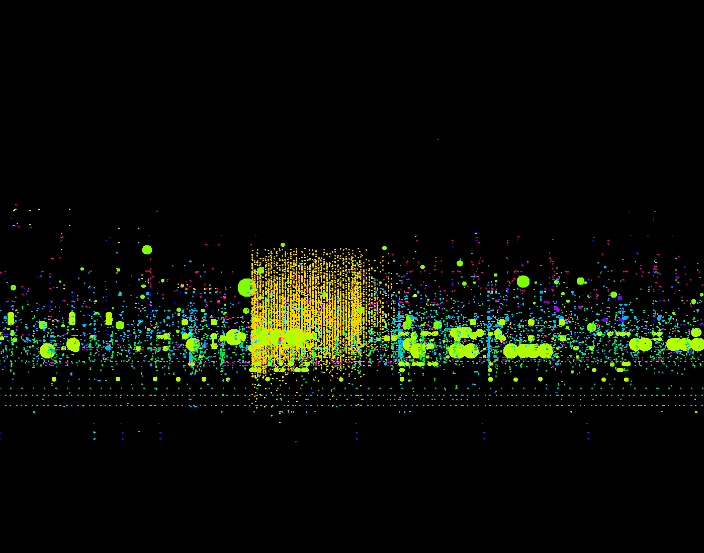
In these visualizations a unique color represents each trader:

minute_515_4The orangish square above shows a single trader perform a burst of concentrated activity within precisely deliniated margins.

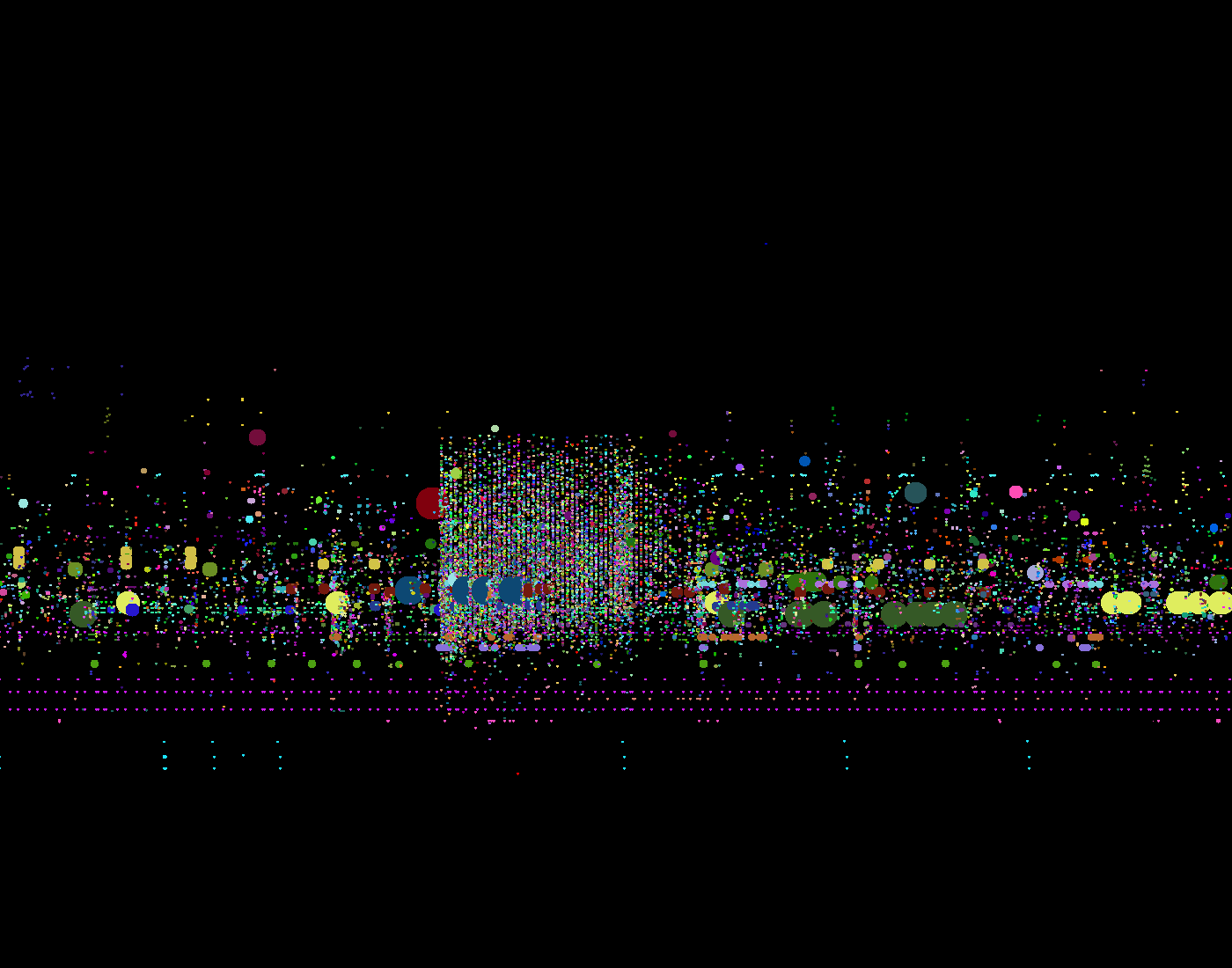
A unique color to represent each stock. The data is the same than in the image above. It becomes visible that the single trader trades a wide range of small stocks.

minute_515_4-1

Google+ Ripples

Google+ Ripples is a visualization of the spread of public posts in the social network Google+. Signed-up members of Google+ can select any public post and have a look at the spread of the post through the network. Only reposts that are set to public are shown in this visualization, so the visualization doesn’t show the reposts of people in their private circles.
The selected post is shown in the middle of the visualization. Reposts are represented by circles labeled with the person’s name that shared the post. Arrows show which person shared which post. If a shared post is shared again, the shared’s post circle becomes bigger. The spread of a message over time can be observed by using the timeline slider at the bottom of the diagram. It is also possible to zoom into diagram, which becomes very helpful when looking at posts that were reposted a lot of times.
The circles have different colors assigned, though it is not clear to me, what these are expressing.

I think generally this is an interesting approach of visualizing “contagion” in a network. It clearly identifies people that are more “contagious” than other people, which could be explained by these people having more social ties in the social network, having something like a leadership role or it could just mean that these people’s friends are more interested in the topic than other people’s friends that didn’t reshare their post. The zoomable user interface is a good way of providing focus and context by interaction. It allows for quite large numbers of elements to be displayed hiding detail information when it is zoomed out, providing more and more information with every zoom-in step.
Some aspects of the interface are worth discussing: For example, why do the circles of reshared posts have to be that large taking away a lot of space? Posts that reshare a post don’t necessarily have to be inside the circle. Also the interface could show all the reposts including the privately shared without providing the name of the sharing person.

Tags: , , , , , , , ,

Stanford Dissertation Browser

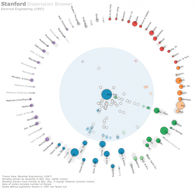
Stanford-Dissertation-Browser-electrical-engineering-625x608The Stanford Dissertation Browser is an interactive tool to explore similarities between different fields of study at Stanford University by examining the language used in the different PhD publications. Fields of study are arranged around a circle with one field of study in the centre. For the subject in the centre similarities with other fields are shown by the distance to the centre. The closer the circles, the more common the language these fields share.

For example, if you select Electrical Engineering the field Computational Science will move close to the centre, which is not a big surprise. When selecting Music, however, Computational Science also moves very close to the centre. Something you might not expect, at least not to this degree. With a slider at the bottom different years can be selected. The different years are shown all the time in the diagram by very subtle grey circles, which display year and field of study, if you hover over them. In this way you get an overview over the distribution over time and can get more details by moving the timeline slider to select specific years.

This way of visualizing a network is similar to the method the research group Research on Complex Systems at Northwestern University used in their visualization of the structural change in the international flight network. In a similar manner, one particular node was put into focus, surrounding nodes being closer to this node when these two nodes were strongly connected by many links. The same ist the case with the different fields of study. The more words they share, the more connections or links are there between these fields, moving them closer together.

Tags: , , , , , , , ,

Visualizing connectivity of airports during Eyjafjallajökull eruption

Eyjafjalljökull2 The Engineering Sciences and Applied Mathematics department at Northwestern University hosts several research projects that deal with complex networks. One of these projects deals with the effect of the ash cloud covering Europe in April 2010 for several days. The reaearch group tried to shed light on the question in what way the event has changed the structure of the complex network that is formed by the flight connections by all the airports around the world. The way they did this was not by looking at the overall topology of the network, but rather by looking at single nodes, the different airports, and calculating their shortest-path length before and after the eruption. The shortest path doesn’t describe the geographical distance between two airports, but rather the connectivity between them. So the more flights occur between two airports, the shorter is its path.

These calculations are shown in a special kind of circular before-after diagrams with one particular airport in the centre of a red circle surrounded by dots that represent all the airports that are connected. It is not clear what exactly the red circle describes. According to the website it is the “approximate distance of the world from Atlanta”. However, it is clearly some kind of threshold. Looking at Atlanta airport before the event we can see that there are several airports within the red circle, mostly North-American, but also some big others like Frankfurt, London or Hongkong. After the event, however, these have been pushed out of the circle, while in general most of the other nodes have been pushed further away from the circle, thus increasing their shortest-path length.

Tags: , , , , , ,

Fighters in a Patent War

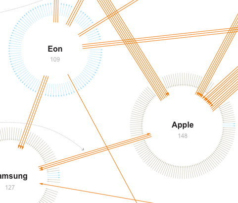
PatentWarsThis network visualization by the New York Times shows patent suits of the ten biggest actors (like Apple, Samsung, Motorola etc.) in the mobile phone market. Suits between these ten companies are represented by orange arrows, while suits against one of the ten companies by other parties are colored grey and suits of one company against other parties have a blue color. These other parties are not more specifically detailed. The total amount of different arrows one company has are arranged in a circle with the effect that the cirle becomes bigger, the more incoming or outgoing suits one company has.

This visualization caught my attention primarily because of the arrangement of the arrows. Thinking of computer networks different segments of the circle could visually encode different ports and their connections in a network. Further research is needed to investigate, if this might prove helpful for security administrators.
Also, for such a visualization it might be more revealing to put more emphasis on the direction of the connections, e.g. by color. Differentiating the direction only by the little arrowhead, as we can observe in the New York Times graphic is a little hard to recognize. For applications such as monitoring a network these kinds of weak differentiations are not enough.

Tags: , , , , ,

The Power Rank

ThePowerNode

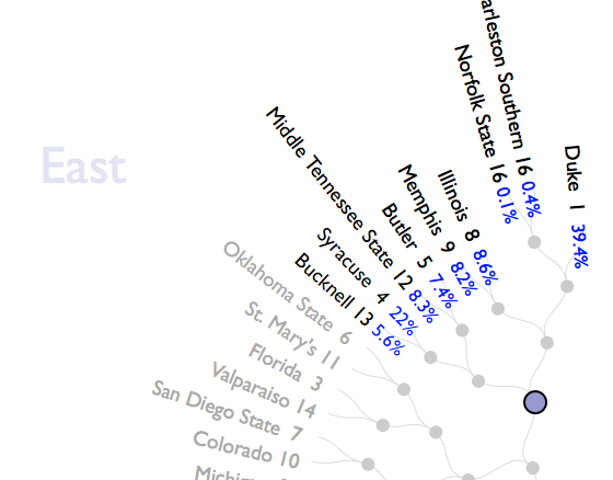
The Power Rank is a visualization of the chances of winning for all the basketball teams participating in the NCAA Tournament. The teams are organized around a circle grouped by the region they are from. In the center of the circle you can see all the games of the tournament represented by dots. These are connected to the different teams that could possibly take part in the game. When hovering over these dots, the teams get highlighted  and the probability of being the winner of this particular game is shown at the team’s label with a percentage value. You can also hover over particular teams to show what the corresponding chances of winning are in the different games leading to the final (which is the dot in the middle).

This visualization is rather uncommon in that it shows a hierarchy in the middle of the circle with a treelike structure. Of course this is a visualization that can handle only a certain amount of data because the space is limited by the circle.

Tags: , , , , , , ,