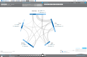
GED VIZ is a HTML5 visualization of economic and demographic relations between countries as network relations. It is highly customizable through different datasets, all countries worldwide and based on a time line. The customized graphic can be exported and used externally.
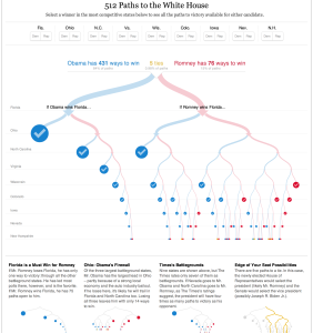
Mike Bostock and Shan Cartners 512 Paths to the White House shows all possible paths to victory to the two 2012 US Presidential candidates Mitt Romney and Barack Obama.
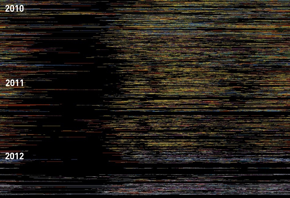
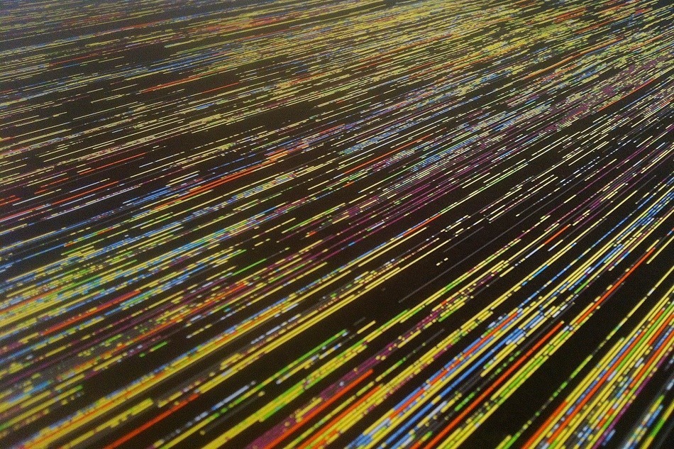
Marcin Ignacs visualization „Every Day of My Life“ is a static poster visualizing his computer usage statistics from the last 2.5 years. Each line represents one day. Colored areas represent different applications while black represent that his computer was turned off. Through this his sleeping patterns, coffee breaks and sleepless nights in front of the computer become visible.
On Tuesday, 4th of June, the “Potsdamer Konferenz für nationale Cybersicherheit” took place at the Hasso-Plattner Institute in Potsdam, Germany. The main goal of the conference was to improve the communication between the government, economy and the different research fields in the issue of cyber-security. For us, it was interesting in two ways: finding the main actors to focus on in our research and learning how the current security situation is rated by the different organisations.
The conference started with a few words of welcome from Director and CEO of the Hasso-Plattner Institute, Prof. Dr. Christoph Meinel. In his short Keynote, which was mostly about the work and research of the HPI IT-Security Engineering Team, he also introduced the audience to the new HPI-Vulnerability-Database.
The HPI-VDB portal is the result of research work being conducted by IT-Security Engineering Team at Prof. Christoph Meinel’s chair “Internet Technologies and Systems” at HPI. It is a comprehensive and up-to-date repository which contains a large number of known vulnerabilities of Software. The vulnerability information being gathered from Internet is evaluated, normalized, and centralized in the high performance database. The textual descriptions about each vulnerability entry are grabbed from the public portals of other vulnerability databases, software vendors, as well as many relevant public web pages, etc. A well-structured data model is used to host all pieces of information which is related to the specific vulnerability entry. Thanks to the high quality data serialized in the high performance In-Memory database, many fancy services can be provided, including browsing, searching, self-diagnosis, Attack Graph (AG), etc. Additionally, we offer many types of API for IT developers to leverage our database for their development. (http://www.hpi.uni-potsdam.de/meinel/security_tech/hpi_vdb.html)
A lot more interesting speakers have been invited to talk from their perspective of cyber security. For example the director of the European Network and Information Security Agency (ENISA) Prof. Udo Helmbrecht made a keynote speech addressed to policy- and decision-makers such as the Bundesland Brandenburg-Ministerpräsident, the Federal Minister, as well as industry representatives and others.
In Focus of our research, this conference was not the very best place to lern new things. But the possibility to make new contacts and meet interesting people in generell was great and we now have a few names to work with in the future time. Also the knowledge of the actors and so called: “big player” in the business is good to have.
A short film about the conference was uploaded on youtube. This video was made by hpi tv and sums up the conference pretty well. (GER only)
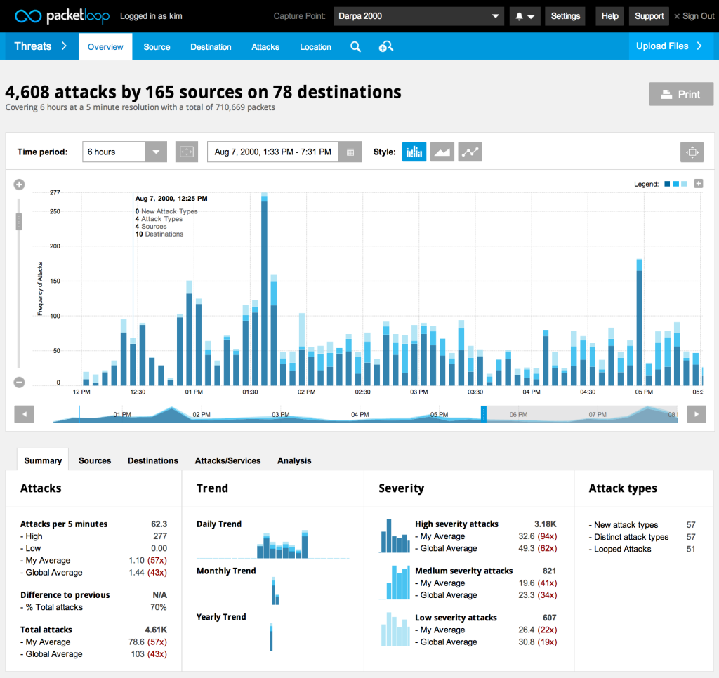
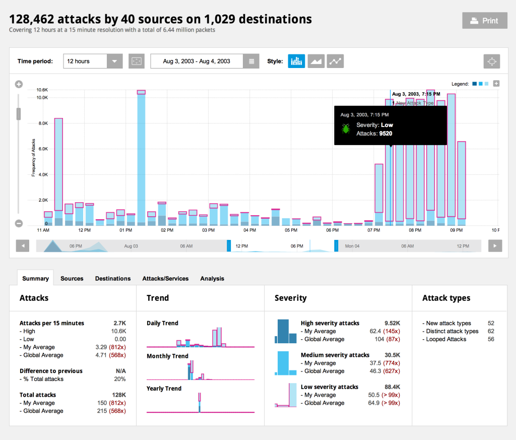
Packetloop is a tool to analyse network traffic through data visualization. It inspects every packet, conversation, protocol and file to find threats and variations from normal traffic. It doesn’t visualize live data rather it is build on file uploads. There are four different ways Packetloop represents the data, by threats, sessions, protocols and files by location. But so far only the threats visualization works.
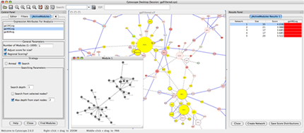
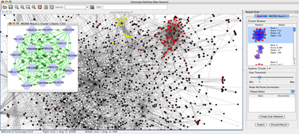
Cytoscape is an open source tool for network visualization in areas like biology, semantic web, social science. The data is presented with network node diagrams of different kinds. With Cytoscape it is possible to find clusters and subnetworks that behave differently than the rest and zoom in and out of the networks to receive more detail.
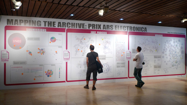
For the 30th anniversary of the Ars Electronica, Moritz Stefaner designed a 10 x 3 meter big wall that visualizes the archive of the Ars Electronica from different perspectives. One part of the visualization looks at quantitative aspects like how many submissions there were in certain years in different categories. A second part shines light on the connections between jury members and awarded artists and a third part shows the historical context of the awarded projects, where they were published, what the effect of the award was on other areas.
In this project Australian data visualization firm dataviz Australia shows the early stages of an attack on a honeypot VoIP server extension. This animation is based on real data and was created with a Ruby-based tool called gltail. The attack is represented by the circles coming in from the right side meeting the defense of the server in the middle, represented by the circles coming from the left side.
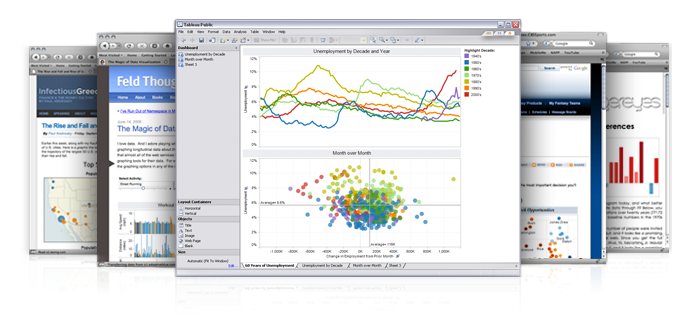
Tableau is a software that provides companies and private users with a simple tool to create basic interactive graphs like maps, bar and line charts, heat maps and other from uploaded data files. There are different versions of the software for different use cases. You can use a desktop version to look at your data or you can create interactive graphics for the web and combine modules to form a dashboard, for example, to keep track of the development of a company’s business.