“Time-series — sets of values changing over time”
A Tour Through the Visualization Zoo
http://hci.stanford.edu/jheer/files/zoo/
This description of the word “Time-Series” is very close to the explanation in Oxfords dictionary which adds that the word comes from a statistic background and often the intervals are equal within the time-series.
http://www.oxforddictionaries.com/definition/english/time-series?q=time-series
Within our research project we are mainly interested in the visualization part within the vast field of statistics. In the book “The Visual Display of Quantitative Information” Edward Tufte defines time-series visualizations as:
“With one dimension marching along to the regular rhythm of seconds, minutes, hours, days, weeks, months, years, centuries, or millennia, the natural ordering of the time scale gives this design a strength and efficiency of interpretation found in no other graphic arrangement.”
Edward R. Tufte
The Visual Display of Quantitative Information
p. 28
Classical datasets of time series visualizations are temperature, wind, condensation (or any other kind of weather measurement), stock data, population change, electricity usage etc. the field is so vast that Tufte writes that in a study that analysed graphics between 1974 and 1980 75% of the graphics where time-series visualizations. Obviously more than 30 years later the field has changed but time-series still seams to be an important part within the area.
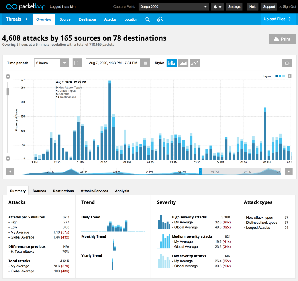
In my opinion most Security Network Data doesn’t provide information with changing values over time initially. For example Flow Data is structured through nodes and edges with additional information. These single incidents in time don’t hold the same characteristics as usual time-series datasets where one value changes. But on a certain level of abstraction (for example by counting incidents within set timeframes) or by combining time-series with other methods like network visualizations this kind of graphics could be very helpful for us.
This article first summarises a few classical time-series examples and than looks at recent developments in the field.
The first time-series visualization was designed in the tenth or possibly eleventh century. It shows the changing positions of the planets with the time on the x-axis.

As we will see the use of the x-axis is still the most common form of presenting time-series graphics. Nathan Yau gives an overview of the most common forms of time-series visualizations in his book “data points” which are in his opinion bar graphs, line charts, dot plots & dot-bar graphs. All of this charts are actually similar in what they do. The only difference is the graphical representation of the data. While all of them use the time dimension on the x-axis, Nathan Yau gives two examples for different representation methods. Radial plots, which are similar to line charts, just circular and calendar heat maps.
Jeffrey Heer, Michael Bostock, and Vadim Ogievetsky from Stanford University are giving a different overview of time-series visualizations in their article “A Tour Through the Visualization Zoo”. Their overview starts with index charts, which is an interactive line chart.
 Index Chart
Stacked Graphs. Which are Area Charts that are stacked on top of each other. They are also called stream graphs. What makes them special is the fact that we get a visual summation of all time-series values.
The controversy around stacked graphs is very big. Alberto Cairo, graphics director at El Mundo Online wrote in a blog article that stacked graphs are “one of the worst graphics the New York Times have published – ever!” on the other hand the publisher of the first paper on stacked graphs wrote: “simplifying the user’s task of tracking individual themes through time by providing a continuous ‘flow’ from one time point to the next”. Furthermore, “we believe this metaphor is familiar and easy to understand and that it requires little cognitive effort to interpret the visualization” both points seam valid to me the cognitive effort needed in some contemporary visualizations is so high that it becomes hard to understand them without putting a lot of effort into them. Stacked Graphs are very simple to understand for the complexity they hold but the information output that can be generated from them is questionable. Andy Kirk from visualisingdata.com credits both sides very fairly in his blog article about the graphs with these comments:
“… a streamgraph is a fantastic solution to displaying large data sets to a mass audience.”
“The main problem facing static streamgraphs lies in the difficulty of reading data points formed by uncommon shapes.”
Tools: D3, Processing
Paper: ThemeRiver: Visualizing Theme Changes over Time,
Stacked Graphs – Geometry & Aesthetics
Example: The Ebb and Flow of Movies, How Different Groups Spend Their Day, Trace (this one is about visualizing wireless networks)
 Stacked Graph
Small Multiples are multiple time-series graphs (what kind these graphs are is another question, in this case, area charts) arranged within a grid. Small multiples are more use full to understand different datasets on its own and not as a summary apposed to the stacked graphs.
 Small Multiples
The last example from the article are horizon graphs. These are actual also area charts which are mirrored and separated by occupacity. This is especially interesting in combination with small multiples because the “data density” is much higher than which classic area charts which leads to more information in a smaller space. An important factor when we are dealing with big datasets.
 Horizon Graph
There is some interesting research about the usefulness of horizon graphs that I recommend: Tool, Paper, Article
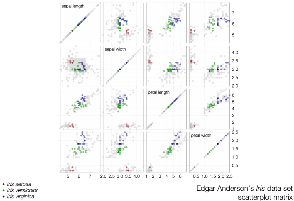
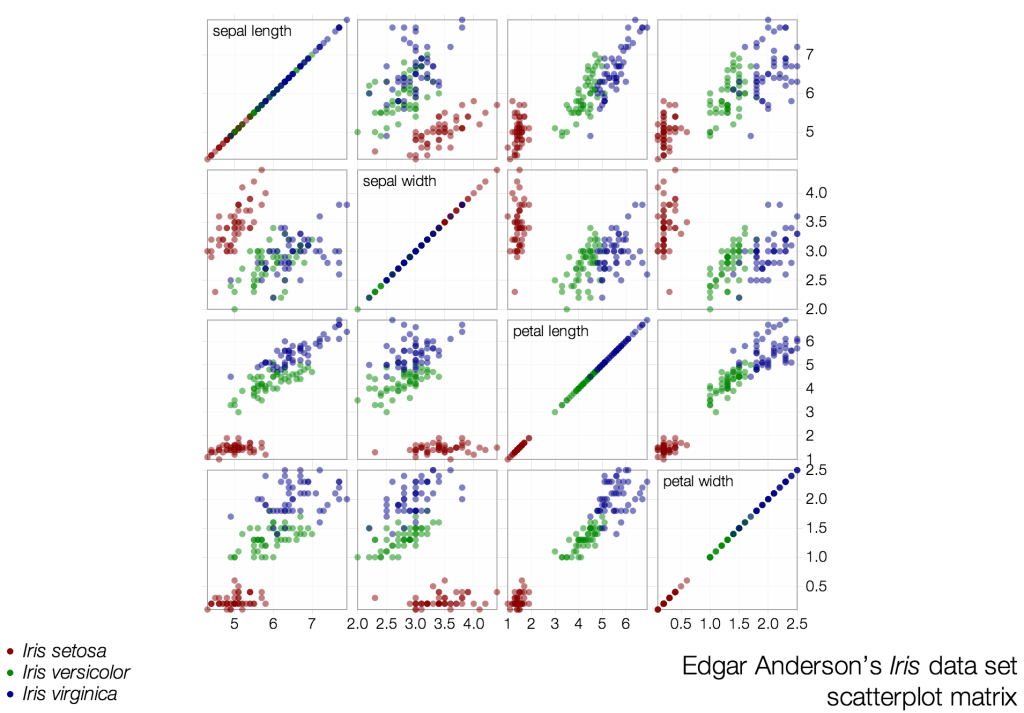
The list of graphics from the Stanford Group are much more contemporary than the examples from Nathan Yau, but still all of these examples use the same mechanism to visualize time-series data by using one axis as a dimension for time. This now more than 1.000 years old way to visualize time is helpful and very common but might not always be the best choice. As we know from scatter-plot visualizations our two space dimensions within a graphic are maybe the most powerful ones for pattern recognition and time might not be the main factor to identify these patterns. So what other ways are there to use time as a dimension within a visualization a part from space?
Animation:
At least since Hans Roslings famous TED talks the usage of animation for displaying time is common and it seams to be the most obvious way to visualize time very literal though time. But the technique needs to be used with caution.
Tamara Munzners visualization principles give a great insight on page 59 why visualizing time with animation is dangerous:
Principle: external cognition vs. internal memory
- easy to compare by moving eyes between side-by-side views –harder to compare visible item to memory of what you saw
Implications for animation
- great for choreographed storytelling
- great for transitions between two states
- poor for many states with changes everywhere
There is also a paper about the topic which gives more insights into the problem.
Small multiples:
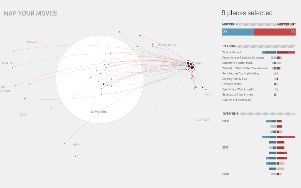
I already mentioned small multiples above but as I raised before the idea behind small multiples is more of a frame for visualizations than an actual kind of visualization. Like this we can also use each multiple as a timeframe. A beautiful example of small multiples with time as a dimension comes from the NYTimes Graphics department.
Binning time in bubbles:
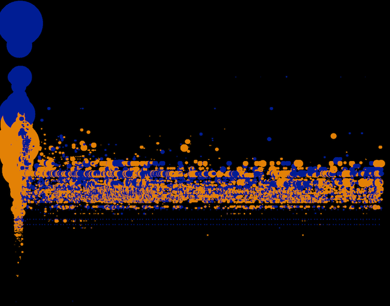
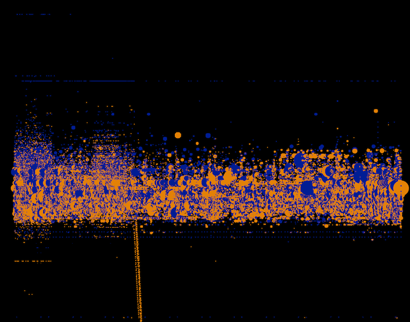
The idea here is to use bubble charts where the time dimension gets binned by minutes, days, years etc. into one bubble and compared to each other. In the Nasdaq 100 Index example each year is represented by one bubble.
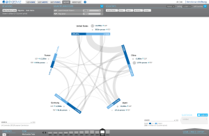
Scatterplots:
Scatterplots where time is displayed as connected points against two variables. This is similar to the animation idea. But in this case the animated dots leave behind a path behind. Also here the NYTimes has a good example.