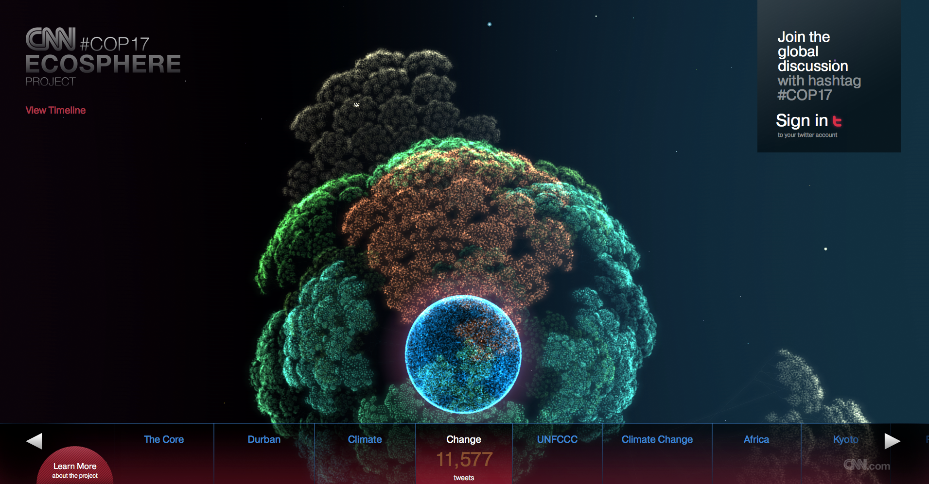
The CNN Ecosphere is an interactive visualization of tweets about the COP17 Conference on Climate Change in Durban, South Africa. Tweets with the hashtag #COP17 are organized in threedimensional trees around a globe. The different discussed topics are split into different trees with each tweet being a leaf in the tree. Depending on how the discussion develops over time, growth in the trees is stimulated more or less. By clicking and dragging the globe and …
Monthly Archives: January 2013
Splunk
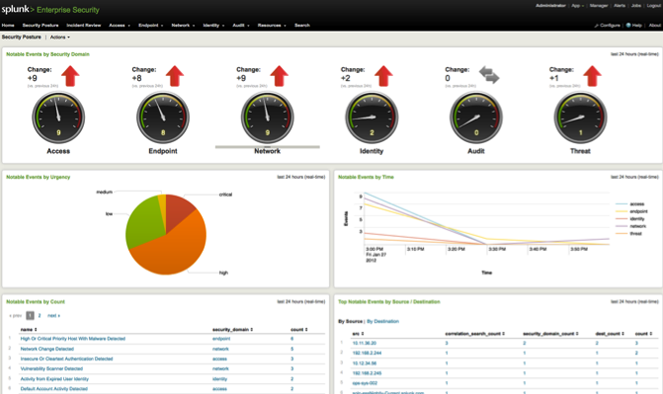
Splunk is a general tool for analysing data in huge IT infrastructures. It consists of different tools that can be utilized in different contexts. With the “Splunk App for Enterprise Security” potential threats and security incidents can be observed, analysed and classified. Users of the app are presented with a web dashboard that visualizes different aspects of the network.
Snort – Intrusion Detection System
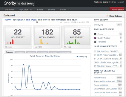
Snort is an open source intrusion detection/prevention system (IDS/IPS) developed by Sourcefire. It is the most used IDS/IPS worldwide. Snort alone has no GUI to interact with, but it’s possible to connect several other Network Security Monitoring systems with it, like Snorby, BASE, OSSIM.
ACARM WUI
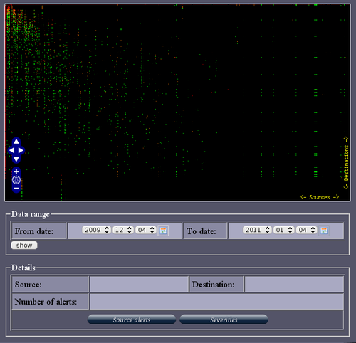
ACARM (Alert Correlation, Assessment and Reaction Module) is a tool that correlates alerts sent by host and network sensors into groups and in that way reducing the amount of messages that need to be viewed by a sytem administrator. There is a Web GUI that let’s the admin observe the different kinds of alerts with different graphical representations like, for example, pie charts, bar charts or more advanced. Different kinds of alerts are color coded …
Cytoscape
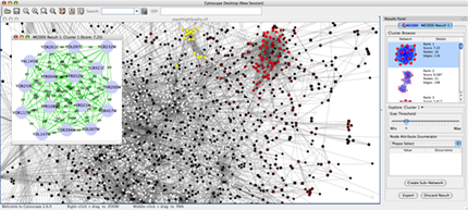
Cytoscape is an open source tool for network visualization in areas like biology, semantic web, social science. The data is presented with network node diagrams of different kinds. With Cytoscape it is possible to find clusters and subnetworks that behave differently than the rest and zoom in and out of the networks to receive more detail.
Table Lens
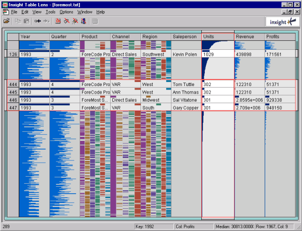
Table Lens is a visualization tool for large data sets, developed by Inxight in 1994. It is based on a “fisheye” visualization of tables, that was developed at Xerox Palo Alto Research Center (see Paper: R.Rao, S.K.Card., The Table Lens: Merging Graphical and Symbolic Representations in an Interactive Focus + Context. Visualization for Tabular Information, CHI’94 Human Factors in Computing Systems. pp. 318-322, 1994
The Observatory
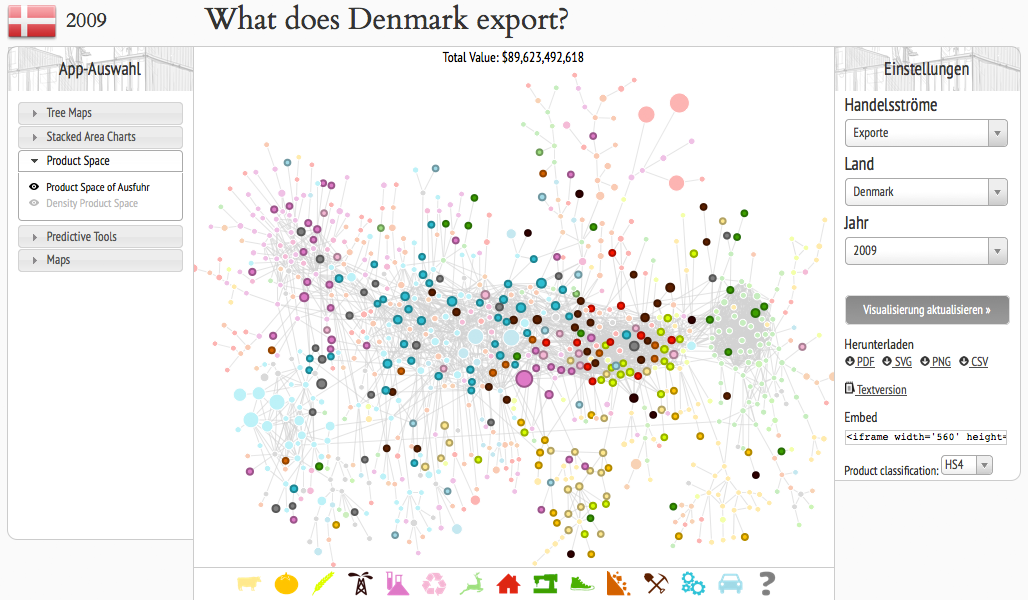
The observatory is a Web-App that allows you to view the the economic situation of different countries by applying different visualizations to the data and as the creators state: “a tool that allows users to quickly compose a visual narrative about countries and the products they exchange”. The user has the choice between treemaps, network node diagrams, stacked area charts, maps, for example. The user can get an overview about imports and exports of single …
How States Have Shifted
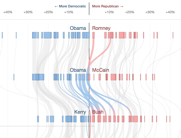
With a flow diagram the New York Times shows how the votes of the different states in the USA changed from one presidential election to the other. By hovering over single states their flow is highlighted while the other states are grayed out. The x-scale describes how many percent of the votes were gained or lost for a party in one election, so if there was a big change, the lines literally “swing”. The thickness …
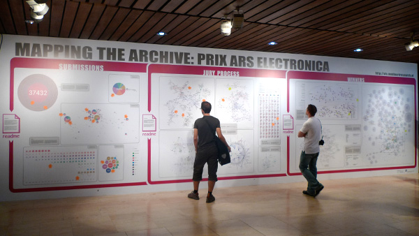
Mapping the Archive
For the 30th anniversary of the Ars Electronica, Moritz Stefaner designed a 10 x 3 meter big wall that visualizes the archive of the Ars Electronica from different perspectives. One part of the visualization looks at quantitative aspects like how many submissions there were in certain years in different categories. A second part shines light on the connections between jury members and awarded artists and a third part shows the historical context of the awarded …
Visualizing a VoIP Security Attack
In this project Australian data visualization firm dataviz Australia shows the early stages of an attack on a honeypot VoIP server extension. This animation is based on real data and was created with a Ruby-based tool called gltail. The attack is represented by the circles coming in from the right side meeting the defense of the server in the middle, represented by the circles coming from the left side.

