The Engineering Sciences and Applied Mathematics department at Northwestern University hosts several research projects that deal with complex networks. One of these projects deals with the effect of the ash cloud covering Europe in April 2010 for several days. The reaearch group tried to shed light on the question in what way the event has changed the structure of the complex network that is formed by the flight connections by all the airports around the world. The way they did this was not by looking at the overall topology of the network, but rather by looking at single nodes, the different airports, and calculating their shortest-path length before and after the eruption. The shortest path doesn’t describe the geographical distance between two airports, but rather the connectivity between them. So the more flights occur between two airports, the shorter is its path.
These calculations are shown in a special kind of circular before-after diagrams with one particular airport in the centre of a red circle surrounded by dots that represent all the airports that are connected. It is not clear what exactly the red circle describes. According to the website it is the “approximate distance of the world from Atlanta”. However, it is clearly some kind of threshold. Looking at Atlanta airport before the event we can see that there are several airports within the red circle, mostly North-American, but also some big others like Frankfurt, London or Hongkong. After the event, however, these have been pushed out of the circle, while in general most of the other nodes have been pushed further away from the circle, thus increasing their shortest-path length.
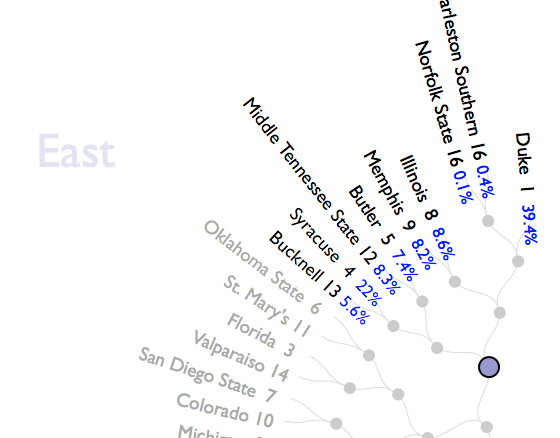
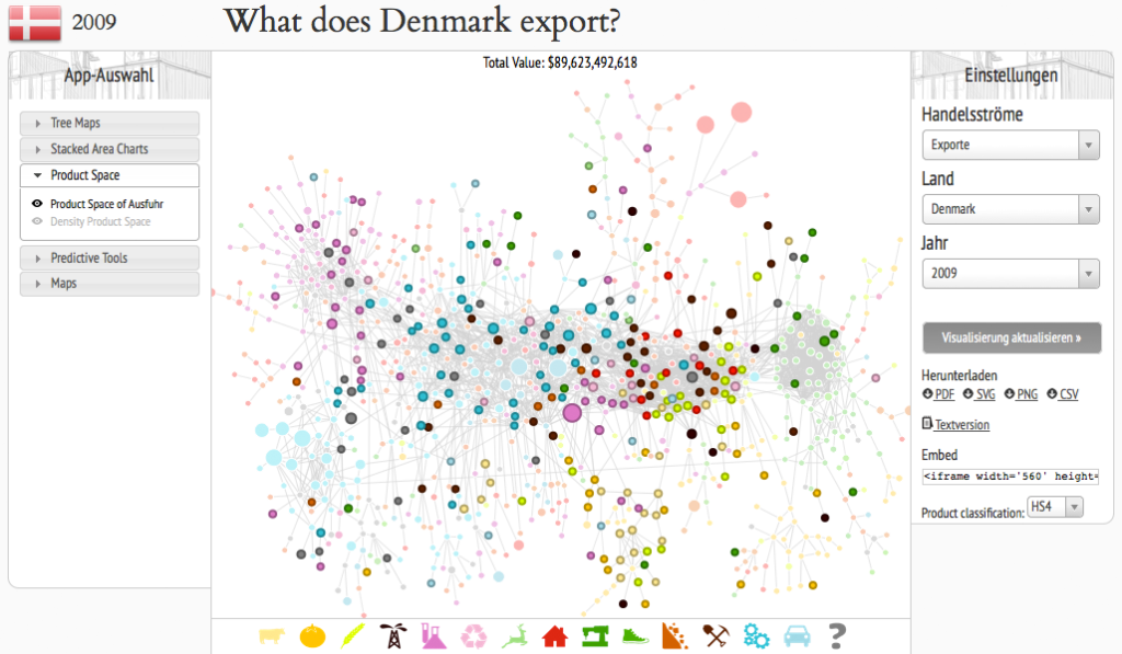
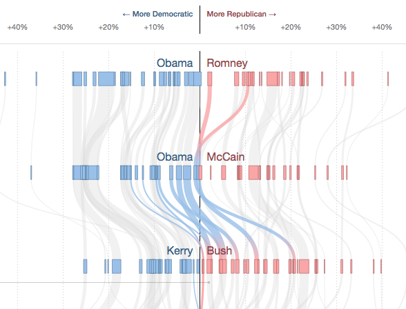
Tags: diagram, graph, network, network science, science, traffic, visualization