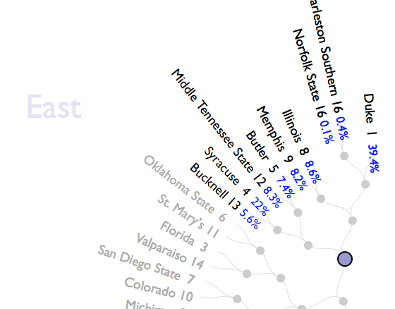
Every time we go online, make a phone call, send an SMS, we use the networks of large operators. These are large technical constructions and they need permanent monitoring and maintenance to work as we expect (which is: we don’t notice they are even there).
Network Operations Centers (NOC) are the institutions where network operators concentrate experts and technology to permanently check parameters of the networks, fix problems, and detect malfunctions and malware. Through their unique position, these NOCs are usually heavily shielded from the outside world.
This video gives a short insight into the Global NOC of AT&T (Bedminster, NJ), including a glimpse on their visualisations and an interview with Chuck Kerschner (Director of Network Operations at AT&T).
 Friedmann and Kerschner in front of the video wall of the AT&T GNOC
Although Lex Friedman of TechHive asks the “right questions” (i.e. the questions we have as well), the answers are often a bit short and too general to learn a lot from them. Still, an interesting video for inspiration.
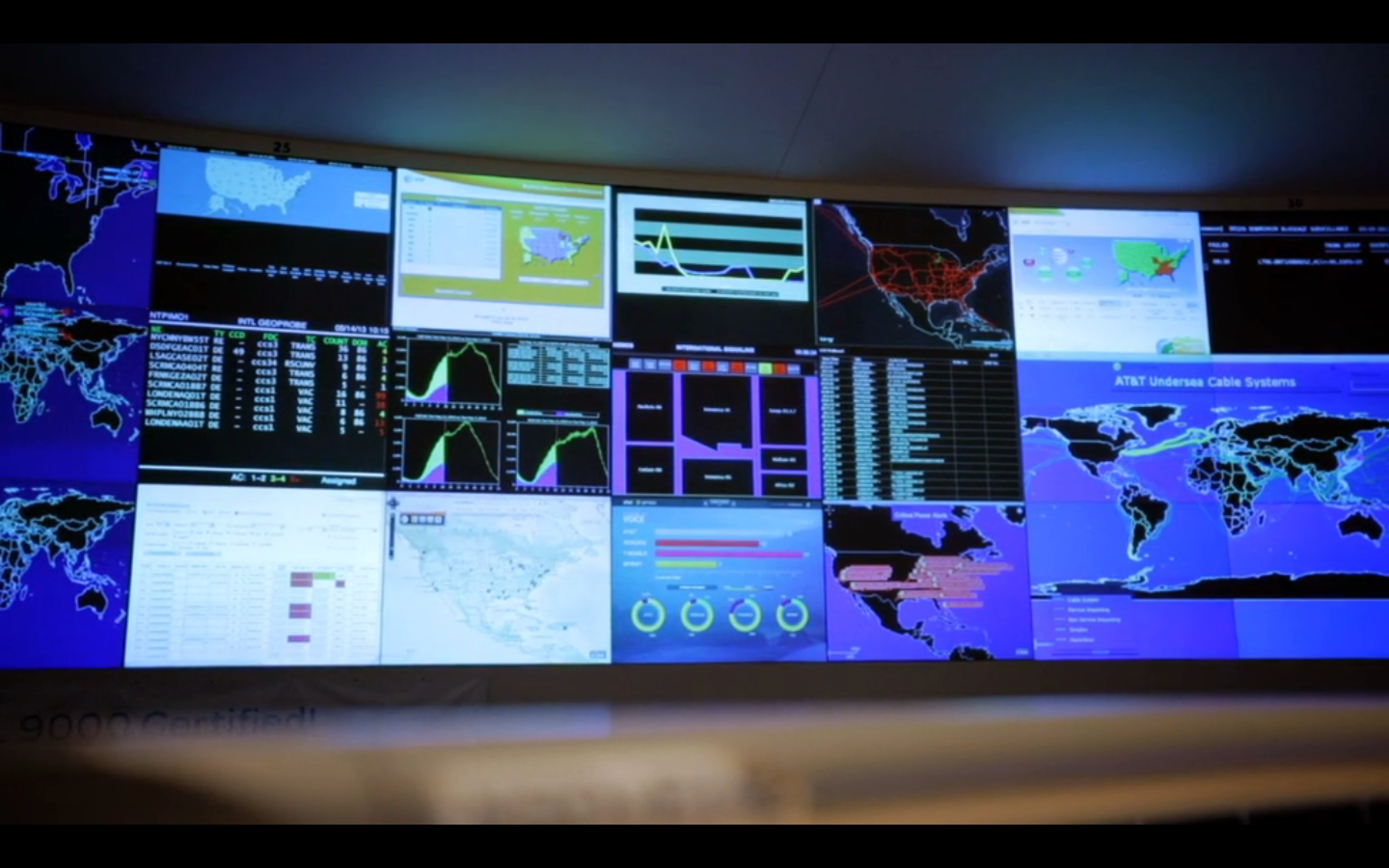 View on the large shared dashboard at AT&T (in the video at 1:20)
A little more detais are availble here as audio, and in an WSJ article about a specialist working at AT&T to prepare for unusual traffic spikes.
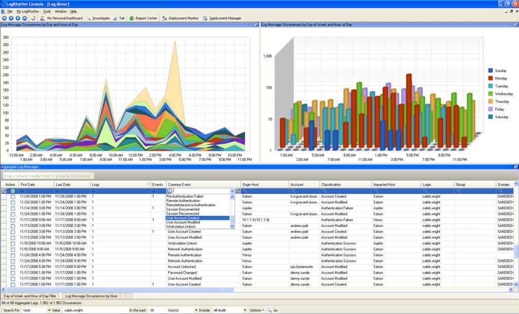
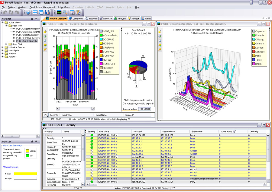
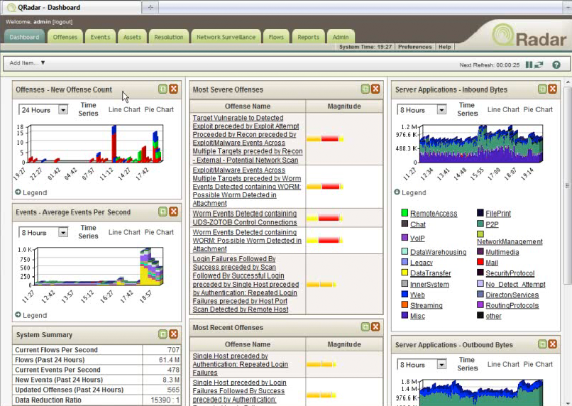
Even closer to the SASER/Siegfried project are (Information) Security Operations Centers (SOCs) – note that Kerschner is mostly concerned with storms or technical outages, not with security threats like viruses or botnets. Steve Roderick is the colleague at the AT&T center responsible for security.
Tags: collaboration, implementation, interface, network, user needs, visualization
 The
The