5 posts Posts by johanneslandstorfer

PixelCarpet

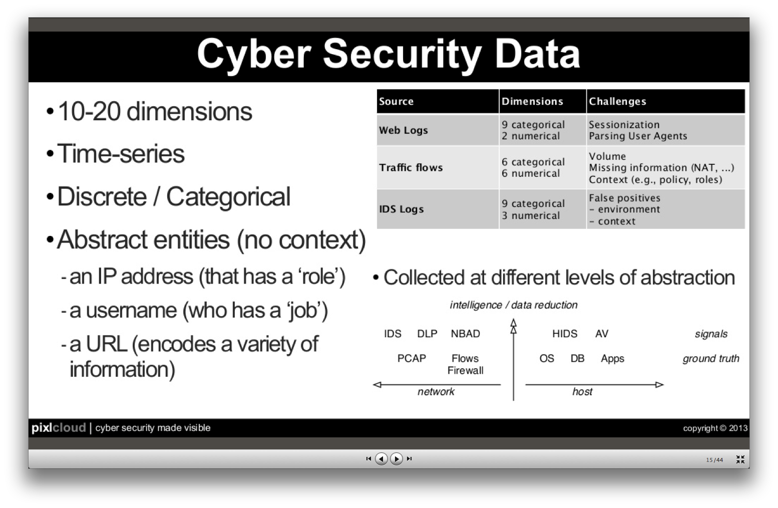
The paper about the Pixel Carpet is one of the results from a collaboration between data visualization researchers from FHP and computer security engineers of various institutions. It builds on the observation that security engineers know their data and the requirements of their work very well. However, they might not be acquainted with advanced visualization techniques. Visualization researchers, on the other hand, know methods to visualize and analyze data but usually lack insight into the specific requirements of computer network security. The paper revolves around two main contributions:

  • results and learnings from a co-creative approach of jointly developing visualizations
  • a pixel oriented visualization technique that graphically represents multi-dimensional data sets (such as computer log files), reflecting ideas from the collaboration

You can get and read the full paper here (27 MB or 4 MB without video). Please feel free to comment to this post or contact us for any details.

Landstorfer, Herrmann, Stange, Dörk, Wettach (2014): Weaving a Carpet from Log Entries: a Network Security Visualization Built with Co-Creation. in Visual Analytics Science and Technology (VAST), 2014 IEEE Conference on, 2014 (to appear)

Co-creative Approach

User centered approaches are well known in the visualization community (although not always implemented) [D'Amico et al. 2005, Munzner et al. 2009]. Jointly developing the visualizations themselves, however, is rather rare. As we have very good experience with co-creative techniques in design and innovation, we wanted to apply them to the domain of data visualization as well. For example, we tried to experiment with data sets during a day-long workshop with a larger group of stakeholders (a session we called the “data picnic” because everyone brought his/her data and tools).

Visualization

For this paper, we focused on a pixel oriented technique [Keim 2000] to fullfill requirements such as visualization of raw data or a chronological view of data to preserve the course of events. We stack graphical representations for various parameters of a log line (such as IP, user name, request or message) so that we get small columns for each log line. Lining up these stacks produces a dense visual representation with distinct patterns. This is why we call it the Pixel Carpet. Other subgroups of our research group took different approaches that can be found at other places in this blog.

Snapshot of the Pixel Carpet interface. Each "multi pixel" represents one log line, as it a appears at the bottom of the screen.Snapshot of the Pixel Carpet interface. Each “multi pixel” represents one log line, as it a appears at the bottom of the screen.

Data and Code

Our data sources included an ssh log (~13.000 lines, unpublished for privacy reasons) and an Apache (web server) access log (~145.000 lines, unpublished), and ~4.500 lines (raw data available, including countries from ip2geo .csv | .json ).

We implemented our ideas in a demonstrator in plain HTML/JavaScript (demo online – caution, will heavily stress your CPU). It helped us iterate quickly and evaluate the idea at various stages, also with new stakeholders. While the code achieves what we need, we are also aware that computing performance is rather bad. If you want to take a look or even improve it, you can find it on github.

To bring it closer to a productive tool, we would turn the Pixel Carpet into a plugin for state-of-the-art data processing engines such as ElasticSearch/Kibana or splunk (scriptable with d3.js since version 6).

Raphael Marty on the need for more human eyes in sec monitoring

Raphael Marty spoke at the 2013 (ACM) conference for Knowledge Discovery and Data mining (KDD’13). It is a very enlightening talk if you want to learn about the status of visualization in computer network security today and core challenges. Ever growing data traffic and persistent problems like false positives in automatic detection cause headaches to network engineers and analysts today, and also Marty admitted often that he has no idea of how to solve them. As he has worked for IBM, HP/ArcSight, and Splunk, the most prestigious companies in this area, this likely not because of lacking expertise).

Marty also generously provided the slides for his talk.

Some key points I took away:

Algorithms can’t cope with targeted or unknown attacks – monitoring needed

Today’s attacks are rarely massive or brute force, but targeted, sophisticated, more often nation state sponsored, and low and slow (this is particularly important as it means you can’t look for typical spikes, which are a sign a mass event – you have to look at long term issues).

Automated tools of today find known threats and work with predefined patterns – they don’t find unknown attacks (0 days) and the more “heuristic” tools produce lots of false positives (i.e. increase the workload for analysts instead of reducing it)

According to Gartner automatic defense systems (prevention) will become entirely useless from in 2020. Instead, you have to monitor and watch out for malicious behaviour (human eyes!), it won’t be solved automatically.

Some figures for current data amounts in a typical security monitoring setup:

marty_detectiontechnology___slideshare-zrlram

So, if everything works out nicely, you still end up with 1000 (highly aggregated/abstracted) alerts that you have to investigate to find the one incident.

Some security data properties:

marty_securitydata___slideshare-zrlram

Challenges with data mining methods

  • Anomaly detection – but how to define “normal”?
  • Association rules – but data is sparse, there’s little continuity in web traffic
  • Clustering – no good algorithms available (for categorical data, such as user names, IP addresses)
  • Classification – data is not consistent (e.g. machine names may change over time)
  • Summarization – disrespect “low and slow” values, which are important

How can visualization help?

  1. make algorithms at work transparent to the user
  2. empower human eyes for understanding, validation, exploration
    • because they bring
    • supreme pattern recognition
    • memory for contexts
    • intuition!
    • predictive capabilities

This is of course a to-do list for our work!

The need for more research

What is the optimal visualization?

– it depends very much on data at hand and your objectives. But there’s also very few research on that and I’m missing that, actually. E.g. what’s a good visualization for firewall data?

And he even shares one of our core problems, the lack of realistic test data:

That’s hard. VAST has some good sets or you can look for cooperations with companies.

Tags: , , , ,

Best in Big Data 2013: On the relevance of user interfaces for big data


Network traffic data becomes “big data” very quickly, given today’s transaction speeds and online data transfer volumes. Consequentially, we attended the Best in Big Data congress in Frankfurt/Main, to learn about big data approaches for our, but also for other domains.


[official pix not available yet][official pix not available yet]

Most of the presntations seemed to be made by big companies to sell to other big companies. Business value of big data and how to deal with it in enterprise contexts consumed most of the slides. In a couple of statements you could hear that big data technology is now well enough understood and spread that the discussion can focus on use and business cases instead. Big data might also move away from IT departments and get closer to domain experts.

For my user experience perspective, I missed aspects like:

  • user interface: how do people get in touch with these vast amounts of data? Do they get autmatically aggregated information? How and by whom are the aggregation methods defined? Do they use visualizations (this was naturally quite important to me)? Analysis tools? How are they different to the traditional ones?
  • use cases: although there were examples of how to put big data into praxis, they were mostly presented on architecture level, with little details on user level and output examples.
  • consumer perspective: the consumer was mostly an object of analysis, and little effort was visible to empower consumer decisions through big data. A 10min exception was Sabine Haase/Morgenpost, who presented the flight route radar. As far as I understood, this project did not use big data techniques very much. It appeared as if it was the “social project” that you need to include.

Haase was also one of two women on stage and she was even acting as a substitute to her male colleagues – there were a couple of women in the audience but in principle it appeared to be a rather masculine topic or event)

There are a couple of aspects that I find worth mentioning in detail:

Better user interfaces

Klaas Bollhoefer from The Unbelievable Machine and Stephan Thiel from StudioNAND held a furious plea for taking the user interface for big data more serious. At the moment, it was still the case that a lot of effort (and budget) is spent on data aggregation, storage, processing, etc. “With an additional 5.000 bucks we create some interface, at the end.” was a common attitude. Bollhoefer found this particularly ill balanced and counter productive for an effective use of information. Obviously, the decisive people in companies knew too few about visualization and design, and thought too little about the eventual users of such a system.

WP_000389

One important feature for analysis tools was direct manipulation of the data and an immediately updating visualisation (think of Bret Victor): this way, the user can try out various deviating values and play through a couple of “what if”-scenarios: such as “if we get a higher conversion rate on our webshop, what would that mean for our profits”. This is something that also otherwise well designed products such as Google Analytics don’t provide yet.

Unfortunately, Klaas and Stephan hardly showed any examples of systems that work that way, from data visualization or other domains. I couldn’t agree more to their statements but some more visuals would have made it far more compelling to the hardly design-literate audience.


From the exhibiting companies, splunk and tableau showed very promising tools that took many of these demands into account. splunk keeps you close to the “raw” data but provides a variety of mini-statistics and context tools that provides the user with a quick understanding of the data set and puts her in control.

tableau, a Stanford viz group spin off, has a drag-n-drop operated interface for data manipulation and super quick access to a wide variety of visualizations to try and to combine. Both stated that they had found new insights in data of their clients within hours, thanks to their tools.


Data ethics and privacy

Big data is keen on data, of course, so the collection or origins of this data might be a little off radar. This was certainly true for the Best in big data-congress. Unintentionally, a video by IBM raised these thoughts: it was asking questions like “Do you know my style? Do you know what I’m buying?” Obviously, it wanted to make the case for more profiling of consumers by means of big data. But questions went on like “Do you know that I tweet about you right now?” and ended in “Know me.”

“… powered by NSA” commented Wolfgang Hackenberg, lawyer and member of Steinbeis transfer center pvm. Despite some awareness of the privacy topic, his talk unfortunately didn’t get to the real dilemmas, let alone proposed solutions. In a huge talk/article from 2012, danah boyd pointed out that taking personal information and statements out of context is very often per se already violating privacy: people make statements in contexts that they understand and find appropriate. If you remove or change the context, a statement might be embarassing or otherwise open for misinterpretation. Big data collection methods tend to be highly susceptible for this offending behaviour – hence, people feel uneasy about it. Hackenberg admited that he doesn’t want to be fully screened himself and that big data for personal information necessarily means the “transparent user”. But he also found strict German and European legislation on privacy simply a burden in international competition for all companies in this domain.

One way could be to involve the “data sources” more in this process and offer them the results of the data analysis. But as I mentioned above, consumer facing ideas were very rare. There is room for improvement.


WP_000387

A remarkable feature of the congress was the venue, inside the Frankfurt Waldstadion (soccer stadium): all breaks allowed the audience to step out of the room and enjoy the sun in the special atmosphere on the ranks of the stadium: a big room for big thoughts.


Tags: , , ,

IPython: interactive/self-documenting data analysis

IPython is an “interactive” framework for writing python code. Code snippets can be run at the programmer’s will and the output will be displayed right below the code. Together with rich input from html-markup to iFrames, an entire workflow can be fully documented. This is very handy for learning, of course, but also to make a complex analysis of a computer incident available and transparent to later readers. As everything (docu, code, output) gets “statically” saved in JSON, the documentation is even independent of the availability of data sources. (Note: there is also a special “Notebook viewer” available online so the reader doesn’t have to know/have IPython her/himself)

As a couple of powerful viz and analysis libraries are available for Python (such as PANDAS), this is (almost) ideal for recording an analysts way to a result.

Ideas for improvement:

  1. make it even more interactive/auto-updating so that changes in one place (“cell”) show up in other places at once (maybe even work with realtime sources?) – maybe towards frameworks like puredata/MAX: this would help explore various parameters for the analysis functions.
  2. Think about some auto-recording functions so that documentation becomes easier and the “author” has to think less about it. This might be especially possible in the narrow context of network security analysis where certain procedures are standardized or very common.

See how it works, e.g. with PCAPS (German)

Thanks to Genua who shared their internal training so well recorded and so generously!

Tags: , , , ,

Inside AT&T Network Operation Center

Every time we go online, make a phone call, send an SMS, we use the networks of large operators. These are large technical constructions and they need permanent monitoring and maintenance to work as we expect (which is: we don’t notice they are even there).

Network Operations Centers (NOC) are the institutions where network operators concentrate experts and technology to permanently check parameters of the networks, fix problems, and detect malfunctions and malware. Through their unique position, these NOCs are usually heavily shielded from the outside world.

This video gives a short insight into the Global NOC of AT&T (Bedminster, NJ), including a glimpse on their visualisations and an interview with Chuck Kerschner (Director of Network Operations at AT&T).

Friedmann and Kerschner in front of the video wall of the AT&T GNOC (click image for video)Friedmann and Kerschner in front of the video wall of the AT&T GNOC

Although Lex Friedman of TechHive asks the “right questions” (i.e. the questions we have as well), the answers are often a bit short and too general to learn a lot from them. Still, an interesting video for inspiration.

View on the large shared dashboard at AT&T (in the video at 1:20)View on the large shared dashboard at AT&T (in the video at 1:20)

A little more detais are availble here as audio, and in an WSJ article about a specialist working at AT&T to prepare for unusual traffic spikes.

Even closer to the SASER/Siegfried project are (Information) Security Operations Centers (SOCs) – note that Kerschner is mostly concerned with storms or technical outages, not with security threats like viruses or botnets. Steve Roderick is the colleague at the AT&T center responsible for security.


Tags: , , , , ,