19 articles Tag visualization

Raphael Marty on the need for more human eyes in sec monitoring

Raphael Marty spoke at the 2013 (ACM) conference for Knowledge Discovery and Data mining (KDD’13). It is a very enlightening talk if you want to learn about the status of visualization in computer network security today and core challenges. Ever growing data traffic and persistent problems like false positives in automatic detection cause headaches to network engineers and analysts today, and also Marty admitted often that he has no idea of how to solve them. As he has worked for IBM, HP/ArcSight, and Splunk, the most prestigious companies in this area, this likely not because of lacking expertise).

Marty also generously provided the slides for his talk.

Some key points I took away:

Algorithms can’t cope with targeted or unknown attacks – monitoring needed

Today’s attacks are rarely massive or brute force, but targeted, sophisticated, more often nation state sponsored, and low and slow (this is particularly important as it means you can’t look for typical spikes, which are a sign a mass event – you have to look at long term issues).

Automated tools of today find known threats and work with predefined patterns – they don’t find unknown attacks (0 days) and the more “heuristic” tools produce lots of false positives (i.e. increase the workload for analysts instead of reducing it)

According to Gartner automatic defense systems (prevention) will become entirely useless from in 2020. Instead, you have to monitor and watch out for malicious behaviour (human eyes!), it won’t be solved automatically.

Some figures for current data amounts in a typical security monitoring setup:

marty_detectiontechnology___slideshare-zrlram

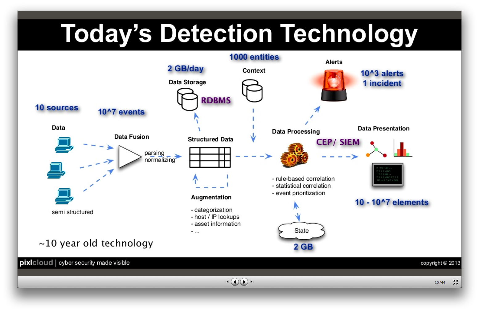
So, if everything works out nicely, you still end up with 1000 (highly aggregated/abstracted) alerts that you have to investigate to find the one incident.

Some security data properties:

marty_securitydata___slideshare-zrlram

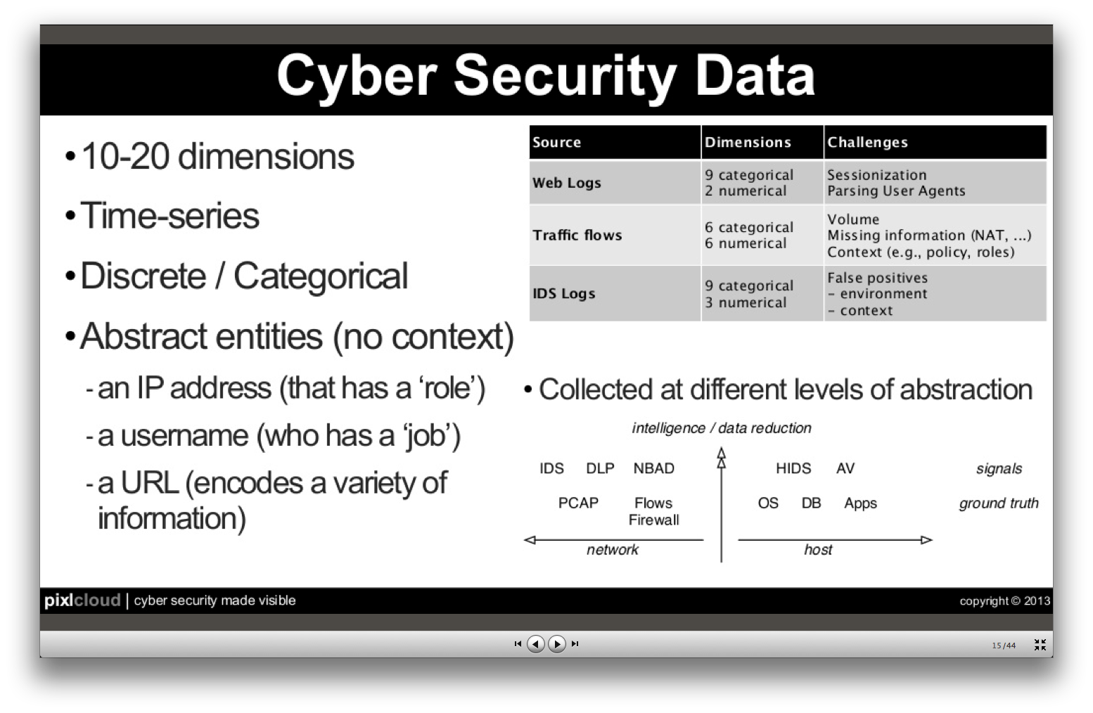
Challenges with data mining methods

  • Anomaly detection – but how to define “normal”?
  • Association rules – but data is sparse, there’s little continuity in web traffic
  • Clustering – no good algorithms available (for categorical data, such as user names, IP addresses)
  • Classification – data is not consistent (e.g. machine names may change over time)
  • Summarization – disrespect “low and slow” values, which are important

How can visualization help?

  1. make algorithms at work transparent to the user
  2. empower human eyes for understanding, validation, exploration
    • because they bring
    • supreme pattern recognition
    • memory for contexts
    • intuition!
    • predictive capabilities

This is of course a to-do list for our work!

The need for more research

What is the optimal visualization?

– it depends very much on data at hand and your objectives. But there’s also very few research on that and I’m missing that, actually. E.g. what’s a good visualization for firewall data?

And he even shares one of our core problems, the lack of realistic test data:

That’s hard. VAST has some good sets or you can look for cooperations with companies.

Tags: , , , ,

Inside AT&T Network Operation Center

Every time we go online, make a phone call, send an SMS, we use the networks of large operators. These are large technical constructions and they need permanent monitoring and maintenance to work as we expect (which is: we don’t notice they are even there).

Network Operations Centers (NOC) are the institutions where network operators concentrate experts and technology to permanently check parameters of the networks, fix problems, and detect malfunctions and malware. Through their unique position, these NOCs are usually heavily shielded from the outside world.

This video gives a short insight into the Global NOC of AT&T (Bedminster, NJ), including a glimpse on their visualisations and an interview with Chuck Kerschner (Director of Network Operations at AT&T).

Friedmann and Kerschner in front of the video wall of the AT&T GNOC (click image for video)Friedmann and Kerschner in front of the video wall of the AT&T GNOC

Although Lex Friedman of TechHive asks the “right questions” (i.e. the questions we have as well), the answers are often a bit short and too general to learn a lot from them. Still, an interesting video for inspiration.

View on the large shared dashboard at AT&T (in the video at 1:20)View on the large shared dashboard at AT&T (in the video at 1:20)

A little more detais are availble here as audio, and in an WSJ article about a specialist working at AT&T to prepare for unusual traffic spikes.

Even closer to the SASER/Siegfried project are (Information) Security Operations Centers (SOCs) – note that Kerschner is mostly concerned with storms or technical outages, not with security threats like viruses or botnets. Steve Roderick is the colleague at the AT&T center responsible for security.


Tags: , , , , ,

Google+ Ripples

Google+ Ripples is a visualization of the spread of public posts in the social network Google+. Signed-up members of Google+ can select any public post and have a look at the spread of the post through the network. Only reposts that are set to public are shown in this visualization, so the visualization doesn’t show the reposts of people in their private circles.
The selected post is shown in the middle of the visualization. Reposts are represented by circles labeled with the person’s name that shared the post. Arrows show which person shared which post. If a shared post is shared again, the shared’s post circle becomes bigger. The spread of a message over time can be observed by using the timeline slider at the bottom of the diagram. It is also possible to zoom into diagram, which becomes very helpful when looking at posts that were reposted a lot of times.
The circles have different colors assigned, though it is not clear to me, what these are expressing.

I think generally this is an interesting approach of visualizing “contagion” in a network. It clearly identifies people that are more “contagious” than other people, which could be explained by these people having more social ties in the social network, having something like a leadership role or it could just mean that these people’s friends are more interested in the topic than other people’s friends that didn’t reshare their post. The zoomable user interface is a good way of providing focus and context by interaction. It allows for quite large numbers of elements to be displayed hiding detail information when it is zoomed out, providing more and more information with every zoom-in step.
Some aspects of the interface are worth discussing: For example, why do the circles of reshared posts have to be that large taking away a lot of space? Posts that reshare a post don’t necessarily have to be inside the circle. Also the interface could show all the reposts including the privately shared without providing the name of the sharing person.

Tags: , , , , , , , ,

Stanford Dissertation Browser

Stanford-Dissertation-Browser-electrical-engineering-625x608The Stanford Dissertation Browser is an interactive tool to explore similarities between different fields of study at Stanford University by examining the language used in the different PhD publications. Fields of study are arranged around a circle with one field of study in the centre. For the subject in the centre similarities with other fields are shown by the distance to the centre. The closer the circles, the more common the language these fields share.

For example, if you select Electrical Engineering the field Computational Science will move close to the centre, which is not a big surprise. When selecting Music, however, Computational Science also moves very close to the centre. Something you might not expect, at least not to this degree. With a slider at the bottom different years can be selected. The different years are shown all the time in the diagram by very subtle grey circles, which display year and field of study, if you hover over them. In this way you get an overview over the distribution over time and can get more details by moving the timeline slider to select specific years.

This way of visualizing a network is similar to the method the research group Research on Complex Systems at Northwestern University used in their visualization of the structural change in the international flight network. In a similar manner, one particular node was put into focus, surrounding nodes being closer to this node when these two nodes were strongly connected by many links. The same ist the case with the different fields of study. The more words they share, the more connections or links are there between these fields, moving them closer together.

Tags: , , , , , , , ,

Visualizing connectivity of airports during Eyjafjallajökull eruption

Eyjafjalljökull2 The Engineering Sciences and Applied Mathematics department at Northwestern University hosts several research projects that deal with complex networks. One of these projects deals with the effect of the ash cloud covering Europe in April 2010 for several days. The reaearch group tried to shed light on the question in what way the event has changed the structure of the complex network that is formed by the flight connections by all the airports around the world. The way they did this was not by looking at the overall topology of the network, but rather by looking at single nodes, the different airports, and calculating their shortest-path length before and after the eruption. The shortest path doesn’t describe the geographical distance between two airports, but rather the connectivity between them. So the more flights occur between two airports, the shorter is its path.

These calculations are shown in a special kind of circular before-after diagrams with one particular airport in the centre of a red circle surrounded by dots that represent all the airports that are connected. It is not clear what exactly the red circle describes. According to the website it is the “approximate distance of the world from Atlanta”. However, it is clearly some kind of threshold. Looking at Atlanta airport before the event we can see that there are several airports within the red circle, mostly North-American, but also some big others like Frankfurt, London or Hongkong. After the event, however, these have been pushed out of the circle, while in general most of the other nodes have been pushed further away from the circle, thus increasing their shortest-path length.

Tags: , , , , , ,

Fighters in a Patent War

PatentWarsThis network visualization by the New York Times shows patent suits of the ten biggest actors (like Apple, Samsung, Motorola etc.) in the mobile phone market. Suits between these ten companies are represented by orange arrows, while suits against one of the ten companies by other parties are colored grey and suits of one company against other parties have a blue color. These other parties are not more specifically detailed. The total amount of different arrows one company has are arranged in a circle with the effect that the cirle becomes bigger, the more incoming or outgoing suits one company has.

This visualization caught my attention primarily because of the arrangement of the arrows. Thinking of computer networks different segments of the circle could visually encode different ports and their connections in a network. Further research is needed to investigate, if this might prove helpful for security administrators.
Also, for such a visualization it might be more revealing to put more emphasis on the direction of the connections, e.g. by color. Differentiating the direction only by the little arrowhead, as we can observe in the New York Times graphic is a little hard to recognize. For applications such as monitoring a network these kinds of weak differentiations are not enough.

Tags: , , , , ,

The Power Rank

ThePowerNode

The Power Rank is a visualization of the chances of winning for all the basketball teams participating in the NCAA Tournament. The teams are organized around a circle grouped by the region they are from. In the center of the circle you can see all the games of the tournament represented by dots. These are connected to the different teams that could possibly take part in the game. When hovering over these dots, the teams get highlighted  and the probability of being the winner of this particular game is shown at the team’s label with a percentage value. You can also hover over particular teams to show what the corresponding chances of winning are in the different games leading to the final (which is the dot in the middle).

This visualization is rather uncommon in that it shows a hierarchy in the middle of the circle with a treelike structure. Of course this is a visualization that can handle only a certain amount of data because the space is limited by the circle.

Tags: , , , , , , ,

Security Log Visualization with a Correlation Engine

On the 28th Chaos Communication Congress organized by Chaos Computer Club in Berlin, network security specialist Chris Kubecka talks about how correlation and visualization of network log data from different devices can support the process of finding potential threats and malware. Usually a network is comprised of a variety of different devices that each generates log files in its own format. Having a separate console for each of these devices

Tags: , , , , , ,

HP Enterprise Security Products and ArcSight

ArcSight ESM Dashboard
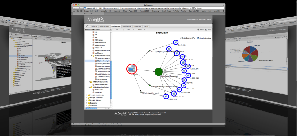
In their business unit ESP (Enterprise Security Products) Hewlett Packard offers several security tools in three different areas: Application Security (Fortify), Information Security (ArcSight) and Network and Cloud Security (Tipping Point). While Fortify is targeted at software security, ArcSight can be considered a SIEM (Security Information and Event Management) system. TippingPoint is a defense system against cyber attacks and threats.
According to Gardner ArcSight can be considered as one of the leaders in the field of SIEMs. There are different ArcSight SIEM solutions available depending, if you are  interested in recording and analyzing log information or if you are focussing on real-time security events. The choice for one of the solutions is also dependent on the size of your network.

Though ArcSight is one of the most popular products on the market on the market it has its shortcomings:

“ArcSight Enterprise Security Manager is complex in terms of deployment and performance management.”

Tags: , , , , , , , ,

CNN Ecosphere

The CNN Ecosphere is an interactive visualization of tweets about the COP17 Conference on Climate Change in Durban, South Africa. Tweets with the hashtag #COP17 are organized in threedimensional trees around a globe. The different discussed topics are split into different trees with each tweet being a leaf in the tree. Depending on how the discussion develops over time, growth in the trees is stimulated more or less. By clicking and dragging the globe and the trees can be turned around. There is a timeline slider at the bottom to select a certain day in the past. Also, Different topics can be selected at the bottom. Clicking them automatically zooms in to these trees. When a tree is zoomed in, the each tweet can be read by hovering over the leaves.
While the visualization is quite impressive and beautiful, the interface is very limited and the overall performance of the app is rather slow.

ecosphere 1

Tags: , , , ,