Network traffic data becomes “big data” very quickly, given today’s transaction speeds and online data transfer volumes. Consequentially, we attended the Best in Big Data congress in Frankfurt/Main, to learn about big data approaches for our, but also for other domains.
Most of the presntations seemed to be made by big companies to sell to other big companies. Business value of big data and how to deal with it in enterprise contexts consumed most of the slides. In a couple of statements you could hear that big data technology is now well enough understood and spread that the discussion can focus on use and business cases instead. Big data might also move away from IT departments and get closer to domain experts.
For my user experience perspective, I missed aspects like:
- user interface: how do people get in touch with these vast amounts of data? Do they get autmatically aggregated information? How and by whom are the aggregation methods defined? Do they use visualizations (this was naturally quite important to me)? Analysis tools? How are they different to the traditional ones?
- use cases: although there were examples of how to put big data into praxis, they were mostly presented on architecture level, with little details on user level and output examples.
- consumer perspective: the consumer was mostly an object of analysis, and little effort was visible to empower consumer decisions through big data. A 10min exception was Sabine Haase/Morgenpost, who presented the flight route radar. As far as I understood, this project did not use big data techniques very much. It appeared as if it was the “social project” that you need to include.
Haase was also one of two women on stage and she was even acting as a substitute to her male colleagues – there were a couple of women in the audience but in principle it appeared to be a rather masculine topic or event)
There are a couple of aspects that I find worth mentioning in detail:
Better user interfaces
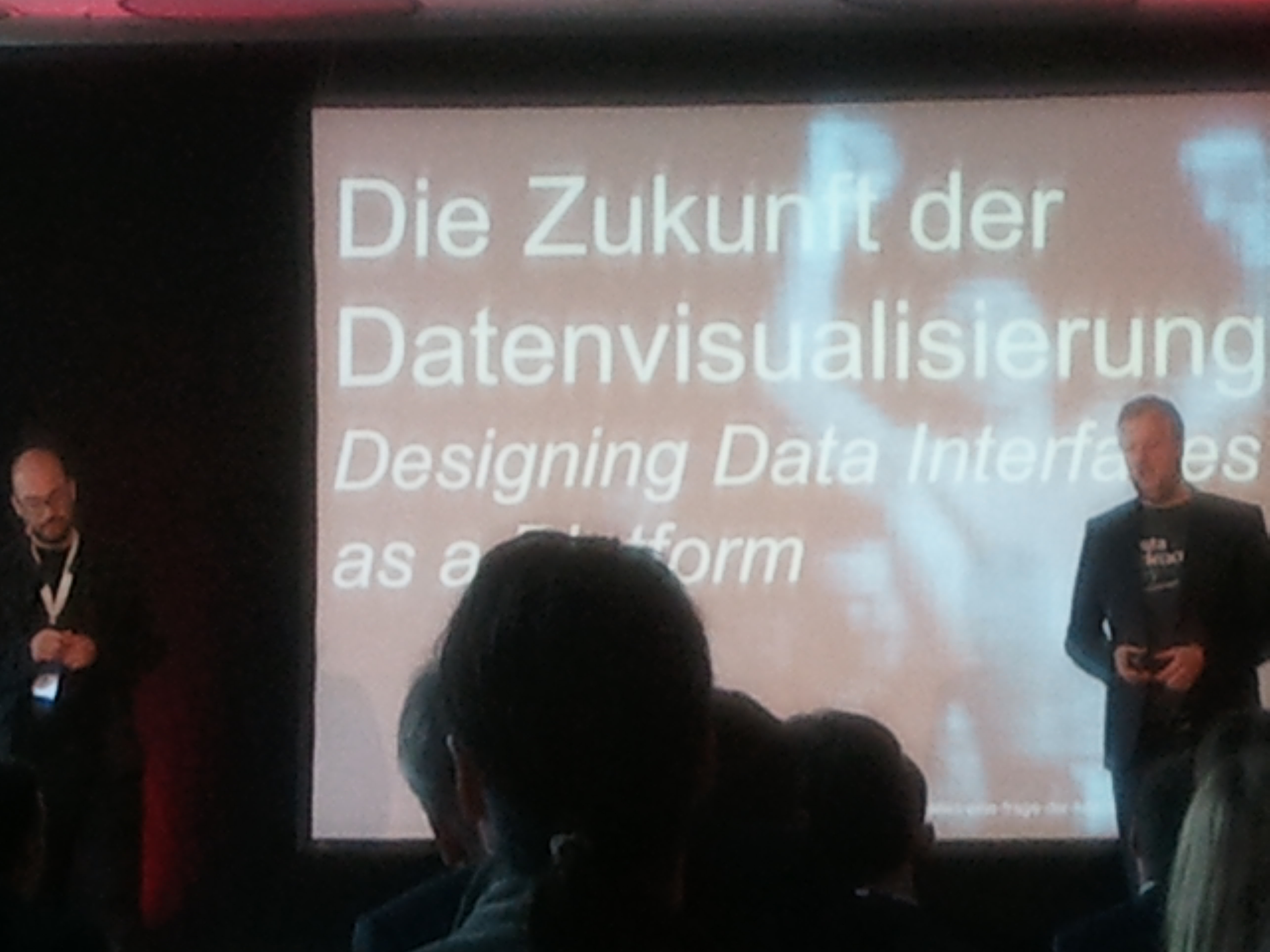
Klaas Bollhoefer from The Unbelievable Machine and Stephan Thiel from StudioNAND held a furious plea for taking the user interface for big data more serious. At the moment, it was still the case that a lot of effort (and budget) is spent on data aggregation, storage, processing, etc. “With an additional 5.000 bucks we create some interface, at the end.” was a common attitude. Bollhoefer found this particularly ill balanced and counter productive for an effective use of information. Obviously, the decisive people in companies knew too few about visualization and design, and thought too little about the eventual users of such a system.
One important feature for analysis tools was direct manipulation of the data and an immediately updating visualisation (think of Bret Victor): this way, the user can try out various deviating values and play through a couple of “what if”-scenarios: such as “if we get a higher conversion rate on our webshop, what would that mean for our profits”. This is something that also otherwise well designed products such as Google Analytics don’t provide yet.
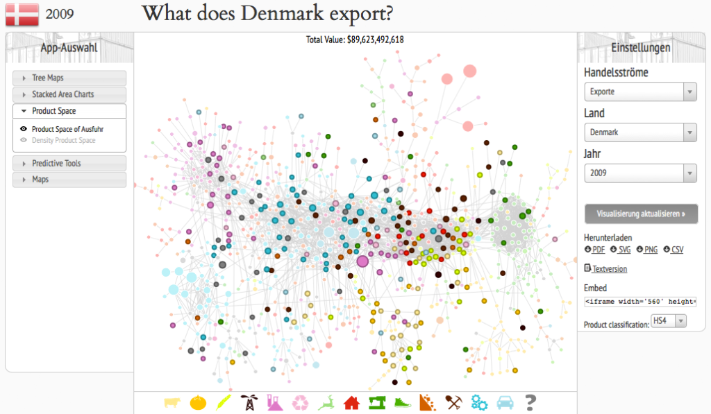
Unfortunately, Klaas and Stephan hardly showed any examples of systems that work that way, from data visualization or other domains. I couldn’t agree more to their statements but some more visuals would have made it far more compelling to the hardly design-literate audience.
From the exhibiting companies, splunk and tableau showed very promising tools that took many of these demands into account. splunk keeps you close to the “raw” data but provides a variety of mini-statistics and context tools that provides the user with a quick understanding of the data set and puts her in control.
tableau, a Stanford viz group spin off, has a drag-n-drop operated interface for data manipulation and super quick access to a wide variety of visualizations to try and to combine. Both stated that they had found new insights in data of their clients within hours, thanks to their tools.
Data ethics and privacy
Big data is keen on data, of course, so the collection or origins of this data might be a little off radar. This was certainly true for the Best in big data-congress. Unintentionally, a video by IBM raised these thoughts: it was asking questions like “Do you know my style? Do you know what I’m buying?” Obviously, it wanted to make the case for more profiling of consumers by means of big data. But questions went on like “Do you know that I tweet about you right now?” and ended in “Know me.”
“… powered by NSA” commented Wolfgang Hackenberg, lawyer and member of Steinbeis transfer center pvm. Despite some awareness of the privacy topic, his talk unfortunately didn’t get to the real dilemmas, let alone proposed solutions. In a huge talk/article from 2012, danah boyd pointed out that taking personal information and statements out of context is very often per se already violating privacy: people make statements in contexts that they understand and find appropriate. If you remove or change the context, a statement might be embarassing or otherwise open for misinterpretation. Big data collection methods tend to be highly susceptible for this offending behaviour – hence, people feel uneasy about it. Hackenberg admited that he doesn’t want to be fully screened himself and that big data for personal information necessarily means the “transparent user”. But he also found strict German and European legislation on privacy simply a burden in international competition for all companies in this domain.
One way could be to involve the “data sources” more in this process and offer them the results of the data analysis. But as I mentioned above, consumer facing ideas were very rare. There is room for improvement.
A remarkable feature of the congress was the venue, inside the Frankfurt Waldstadion (soccer stadium): all breaks allowed the audience to step out of the room and enjoy the sun in the special atmosphere on the ranks of the stadium: a big room for big thoughts.
Tags: bigdata, conference, talk, tools

![[official pix not available yet]](http://complexdatavisualized.com/wp-content/uploads/2013/09/BigDataPlenum.jpg)


