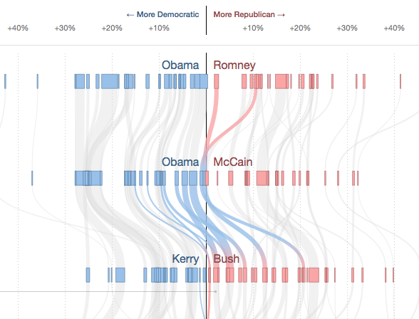
With a flow diagram the New York Times shows how the votes of the different states in the USA changed from one presidential election to the other. By hovering over single states their flow is highlighted while the other states are grayed out. The x-scale describes how many percent of the votes were gained or lost for a party in one election, so if there was a big change, the lines literally “swing”. The thickness of the lines is proportional to the number of electoral votes one state has.