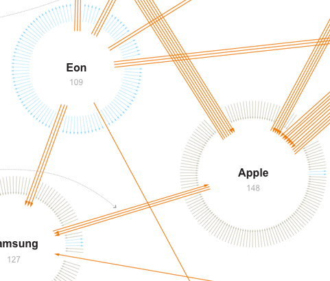
 This network visualization by the New York Times shows patent suits of the ten biggest actors (like Apple, Samsung, Motorola etc.) in the mobile phone market. Suits between these ten companies are represented by orange arrows, while suits against one of the ten companies by other parties are colored grey and suits of one company against other parties have a blue color. These other parties are not more specifically detailed. The total amount of different arrows one company has are arranged in a circle with the effect that the cirle becomes bigger, the more incoming or outgoing suits one company has.
This visualization caught my attention primarily because of the arrangement of the arrows. Thinking of computer networks different segments of the circle could visually encode different ports and their connections in a network. Further research is needed to investigate, if this might prove helpful for security administrators.
Also, for such a visualization it might be more revealing to put more emphasis on the direction of the connections, e.g. by color. Differentiating the direction only by the little arrowhead, as we can observe in the New York Times graphic is a little hard to recognize. For applications such as monitoring a network these kinds of weak differentiations are not enough.
