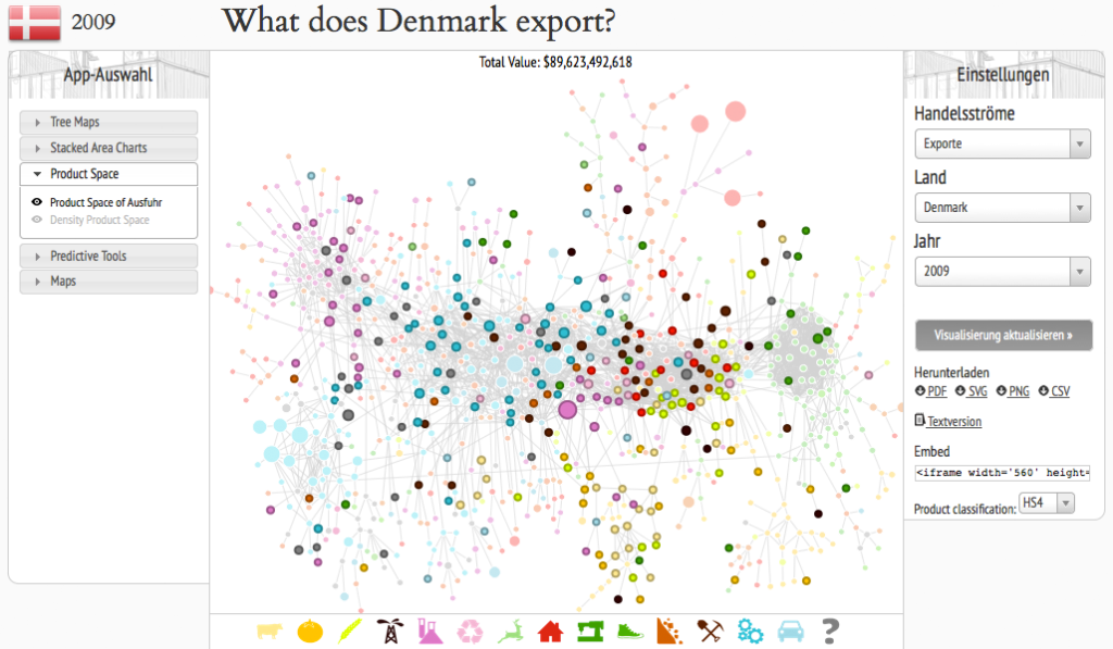
The observatory is a Web-App that allows you to view the the economic situation of different countries by applying different visualizations to the data and as the creators state: “a tool that allows users to quickly compose a visual narrative about countries and the products they exchange”. The user has the choice between treemaps, network node diagrams, stacked area charts, maps, for example. The user can get an overview about imports and exports of single countries, either by amount in a treemap or by time in a stacked area chart. In a network node diagram it can be observed how products are connected wioth each other. Also, products can be put into focus by showing the total export of a product and how much of the product different countries exported. The interface is a bit clunky, there is no strict information hierarchy, so sometimes you don’t realize what exactly you’re looking at at first glance.
