Google+ Ripples is a visualization of the spread of public posts in the social network Google+. Signed-up members of Google+ can select any public post and have a look at the spread of the post through the network. Only reposts that are set to public are shown in this visualization, so the visualization doesn’t show the reposts of people in their private circles. The selected post is shown in the middle of the visualization. Reposts …
Monthly Archives: April 2013
Stanford Dissertation Browser
The Stanford Dissertation Browser is an interactive tool to explore similarities between different fields of study at Stanford University by examining the language used in the different PhD publications. Fields of study are arranged around a circle with one field of study in the centre. For the subject in the centre similarities with other fields are shown by the distance to the centre. The closer the circles, the more common the language these fields share. …
Visualizing connectivity of airports during Eyjafjallajökull eruption
The Engineering Sciences and Applied Mathematics department at Northwestern University hosts several research projects that deal with complex networks. One of these projects deals with the effect of the ash cloud covering Europe in April 2010 for several days. The reaearch group tried to shed light on the question in what way the event has changed the structure of the complex network that is formed by the flight connections by all the airports around the …
Fighters in a Patent War
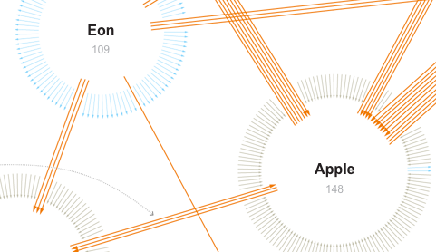
This network visualization by the New York Times shows patent suits of the ten biggest actors (like Apple, Samsung, Motorola etc.) in the mobile phone market. Suits between these ten companies are represented by orange arrows, while suits against one of the ten companies by other parties are colored grey and suits of one company against other parties have a blue color. These other parties are not more specifically detailed. The total amount of different …


