18 articles Articles posted in Visualizations

NICT Daedalus Cyber-Attack Alert System

http://www.youtube.com/watch?feature=player_embedded&v=3u5u5A8_SE0#at=77

The National Institute of Information and Communications Technology (NICT)  a Japanese research institute focussing on different areas in the field of ICT has developed a system for detecting and visualizing attacks on networks. Information about attacks and possible alerts is presented in a rather sophisticated visual way.

There is not a lot of information about the project except a short text and a video showing the system in action. According to the video, the Internet is represented by a wireframed 3D globe in the middle of the screen surrounded by several donut charts each one representing a network. The donut chart shows with two colors (black and blue) which IP-adresses are used (blue) and which ones are not used. Alerts associated with certain IP-sources and -destinations are marked on the donut chart with a sign. These can be clicked to get more details about the alert. The application is supposed to be used in conjunction with a security system, so it’s not a standalone SIEM or something comparable.

There is not more information about how to interact with the system. It seems interaction with the system is rather limited, functioning more as a general visual overview. Though it’s an interesting visualization, I think a question about the practical quality of the system might be justified. It seems like without the ability to filter the visual representation by certain attributes it might be difficult to differentiate important information from negligible. Also, it’s not clear why they use a wireframe globe to show connections to the web. Without the geographical information it seems rather odd because lines going to certain points on the globe don’t provide you with additional useful information. Another question arises when looking at the donut charts: What does the position of IP-adresses on the ring segment express? Is it random? Might have been helpful to show the actual network topology or show the network structure by other visual means in a simpler manner, so we could see which parts of a network are attacked by what countries for example.


Security Log Visualization with a Correlation Engine

On the 28th Chaos Communication Congress organized by Chaos Computer Club in Berlin, network security specialist Chris Kubecka talks about how correlation and visualization of network log data from different devices can support the process of finding potential threats and malware. Usually a network is comprised of a variety of different devices that each generates log files in its own format. Having a separate console for each of these devices

Tags: , , , , , ,

CNN Ecosphere

The CNN Ecosphere is an interactive visualization of tweets about the COP17 Conference on Climate Change in Durban, South Africa. Tweets with the hashtag #COP17 are organized in threedimensional trees around a globe. The different discussed topics are split into different trees with each tweet being a leaf in the tree. Depending on how the discussion develops over time, growth in the trees is stimulated more or less. By clicking and dragging the globe and the trees can be turned around. There is a timeline slider at the bottom to select a certain day in the past. Also, Different topics can be selected at the bottom. Clicking them automatically zooms in to these trees. When a tree is zoomed in, the each tweet can be read by hovering over the leaves.
While the visualization is quite impressive and beautiful, the interface is very limited and the overall performance of the app is rather slow.

ecosphere 1

Tags: , , , ,

Splunk

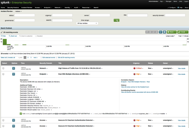
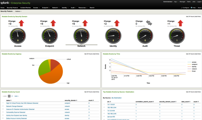
splunk_dashboard 2 splunk_dashboard

Splunk is a general tool for analysing data in huge IT infrastructures. It consists of different tools that can be utilized in different contexts. With the “Splunk App for Enterprise Security” potential threats and security incidents can be observed, analysed and classified. Users of the app are presented with a web dashboard that visualizes different aspects of the network.

Tags: , , , , , , , , , ,

Table Lens

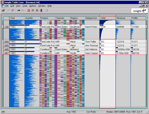
Table Lens is a visualization tool for large data sets, developed by Inxight in 1994. It is based on a “fisheye” visualization of tables, that was developed at Xerox Palo Alto Research Center (see Paper: R.Rao, S.K.Card., The Table Lens: Merging Graphical and Symbolic Representations in an Interactive Focus + Context. Visualization for Tabular Information, CHI’94 Human Factors in Computing Systems. pp. 318-322, 1994

table lens

Tags: , , , ,

The Observatory

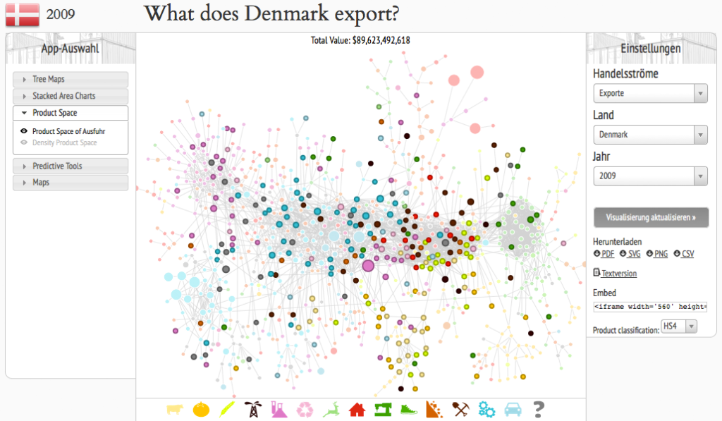
theObserver

The observatory is a Web-App that allows you to view the the economic situation of different countries by applying different visualizations to the data and as the creators state: “a tool that allows users to quickly compose a visual narrative about countries and the products they exchange”. The user has the choice between treemaps, network node diagrams, stacked area charts, maps, for example. The user can get an overview about imports and exports of single countries, either by amount in a treemap or by time in a stacked area chart. In a network node diagram it can be observed how products are connected wioth each other. Also, products can be put into focus by showing the total export of a product and how much of the product different countries exported. The interface is a bit clunky, there is no strict information hierarchy, so sometimes you don’t realize what exactly you’re looking at at first glance.

Tags: , , , ,

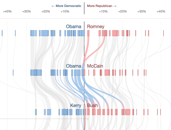
How States Have Shifted

swing states

With a flow diagram the New York Times shows how the votes of the different states in the USA changed from one presidential election to the other. By hovering over single states their flow is highlighted while the other states are grayed out. The x-scale describes how many percent of the votes were gained or lost for a party in one election, so if there was a big change, the lines literally “swing”. The thickness of the lines is proportional to the number of electoral votes one state has.

Tags: , , , , , , ,

Visualizing a VoIP Security Attack

In this project Australian data visualization firm dataviz Australia shows the early stages of an attack on a honeypot VoIP server extension. This animation is based on real data and was created with a Ruby-based tool called gltail. The attack is represented by the circles coming in from the right side meeting the defense of the server in the middle, represented by the circles coming from the left side.

Tags: , , ,