11 articles Tag tool

IPython: interactive/self-documenting data analysis

IPython is an “interactive” framework for writing python code. Code snippets can be run at the programmer’s will and the output will be displayed right below the code. Together with rich input from html-markup to iFrames, an entire workflow can be fully documented. This is very handy for learning, of course, but also to make a complex analysis of a computer incident available and transparent to later readers. As everything (docu, code, output) gets “statically” saved in JSON, the documentation is even independent of the availability of data sources. (Note: there is also a special “Notebook viewer” available online so the reader doesn’t have to know/have IPython her/himself)

As a couple of powerful viz and analysis libraries are available for Python (such as PANDAS), this is (almost) ideal for recording an analysts way to a result.

Ideas for improvement:

  1. make it even more interactive/auto-updating so that changes in one place (“cell”) show up in other places at once (maybe even work with realtime sources?) – maybe towards frameworks like puredata/MAX: this would help explore various parameters for the analysis functions.
  2. Think about some auto-recording functions so that documentation becomes easier and the “author” has to think less about it. This might be especially possible in the narrow context of network security analysis where certain procedures are standardized or very common.

See how it works, e.g. with PCAPS (German)

Thanks to Genua who shared their internal training so well recorded and so generously!

Tags: , , , ,

Stanford Dissertation Browser

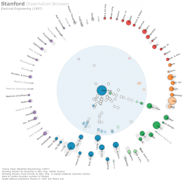
Stanford-Dissertation-Browser-electrical-engineering-625x608The Stanford Dissertation Browser is an interactive tool to explore similarities between different fields of study at Stanford University by examining the language used in the different PhD publications. Fields of study are arranged around a circle with one field of study in the centre. For the subject in the centre similarities with other fields are shown by the distance to the centre. The closer the circles, the more common the language these fields share.

For example, if you select Electrical Engineering the field Computational Science will move close to the centre, which is not a big surprise. When selecting Music, however, Computational Science also moves very close to the centre. Something you might not expect, at least not to this degree. With a slider at the bottom different years can be selected. The different years are shown all the time in the diagram by very subtle grey circles, which display year and field of study, if you hover over them. In this way you get an overview over the distribution over time and can get more details by moving the timeline slider to select specific years.

This way of visualizing a network is similar to the method the research group Research on Complex Systems at Northwestern University used in their visualization of the structural change in the international flight network. In a similar manner, one particular node was put into focus, surrounding nodes being closer to this node when these two nodes were strongly connected by many links. The same ist the case with the different fields of study. The more words they share, the more connections or links are there between these fields, moving them closer together.

Tags: , , , , , , , ,

Security Log Visualization with a Correlation Engine

On the 28th Chaos Communication Congress organized by Chaos Computer Club in Berlin, network security specialist Chris Kubecka talks about how correlation and visualization of network log data from different devices can support the process of finding potential threats and malware. Usually a network is comprised of a variety of different devices that each generates log files in its own format. Having a separate console for each of these devices

Tags: , , , , , ,

LogRhythm

LogRhythm

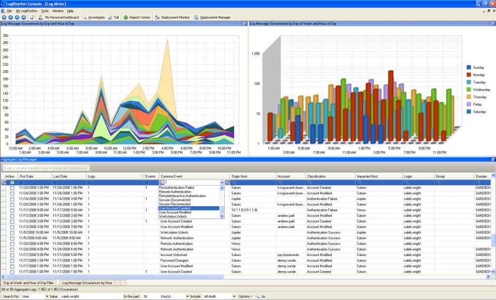
LogRhythm is a SIEM that can be applied either in smaller organizations as a single software instance or in midsize to large organizations as a combination of different software applications. It offers log management, event management, reporting, user and file integrity monitoring. The product is easily and quickly deployed due to a helpful configuration wizard. Though LogRhythm is capable of event correlation, compared to its competitors it’s very basic and optimized for the most common use cases. Gartner has positioned the product in their Magic Quadrant for Security Information and Event Management as one of the leaders.

Tags: , , , , , , , , ,

Sentinel, Security Manager (NetIQ)

NetIQ Sentinel

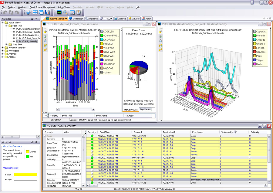
The company NetIQ offers two SIEM solutions: Sentinel and Security Manager. Sentinel is a product originally offered by Novell. With the recent acquisition of the company by NetIQ there are two products overlapping in their functionality. In the future all functionality will be merged into the Sentinel solution. Sentinel’s strength lies in event correlation and real-time event management. Security Manager lacks this functionality and focuses more on host- and agentbased monitoring capabilities for server platforms, something missing in most SIEMs. Sentinel is a leader in the Gartner Magic Quadrant 2012

Tags: , , , , , , , , ,

Enterprise Security Manager (McAfee)

McAfee NitroSecurityMcAfee NitroSecurity 2

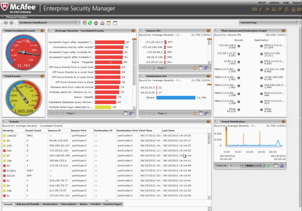
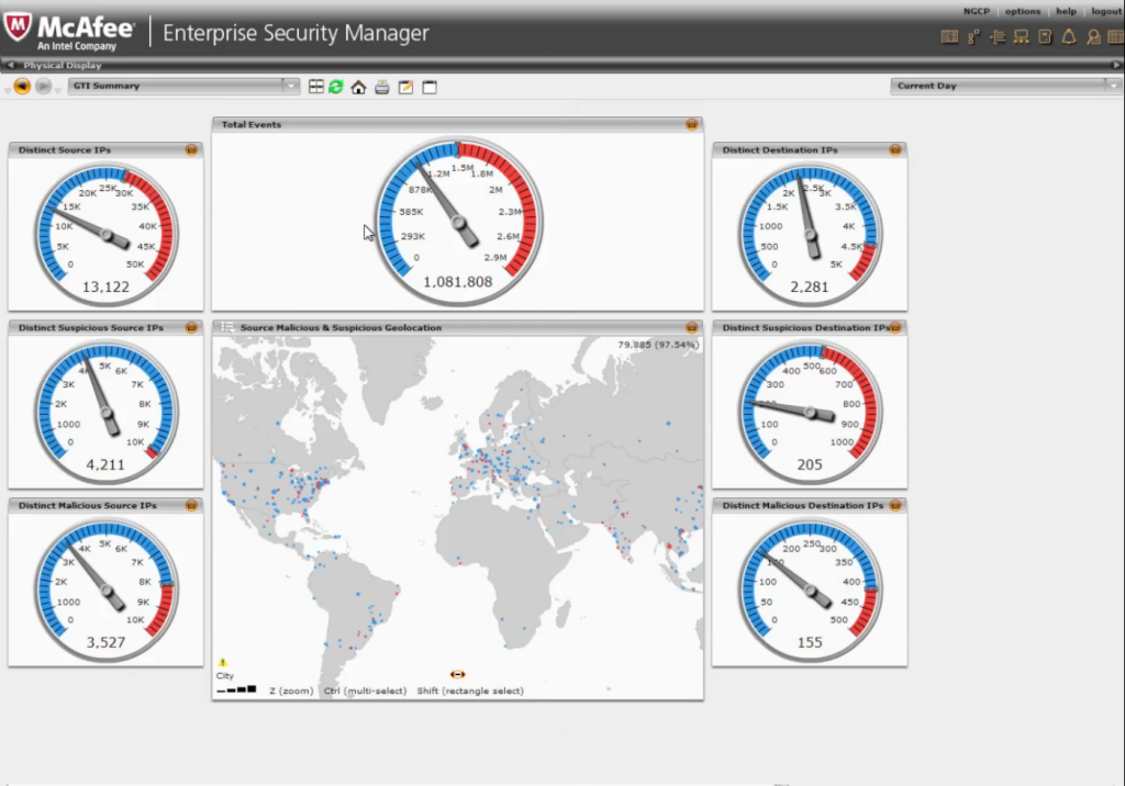
McAfee NitroSecurity is a software that offers SIEM functionality and log management in one single tool separating it from other SIEM systems. It is scalable and has a high performance, which makes it especially useful for organizations that need to analyse huge numbers of events. The company itself emphasizes the speed of the product as an outstanding feature. It is one of the five products positioned as leader in the Magic Quadrant for Security Information and Event Management.

Tags: , , , , , , ,

Q1 Labs (IBM)

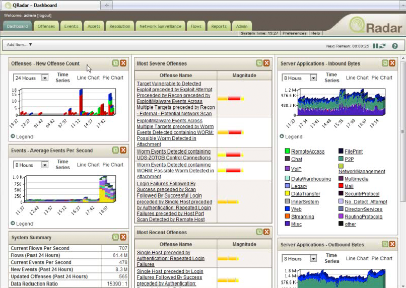
IBM offers an extensive security system solution called Q1 Labs. This includes several products for different security aspects, like, for example, QRadar Log Manager for collecting, archiving and analyzing network and security event logs or QRadar SIEM for real-time analysis of security alerts and correlating data from different sources to detect any threats. The product distinguishes itself from other products by its ability to collect and process NetFlow data, by deep packet inspection (DPI) and behavior analysis for all supported event sources. According to Gartner it can be considered one of the leaders in the field (Gartner 2012).

QRadar SIEM Dashboard

Tags: , , , , , , ,

HP Enterprise Security Products and ArcSight

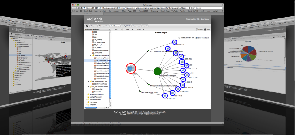
ArcSight ESM DashboardIn their business unit ESP (Enterprise Security Products) Hewlett Packard offers several security tools in three different areas: Application Security (Fortify), Information Security (ArcSight) and Network and Cloud Security (Tipping Point). While Fortify is targeted at software security, ArcSight can be considered a SIEM (Security Information and Event Management) system. TippingPoint is a defense system against cyber attacks and threats.
According to Gardner ArcSight can be considered as one of the leaders in the field of SIEMs. There are different ArcSight SIEM solutions available depending, if you are  interested in recording and analyzing log information or if you are focussing on real-time security events. The choice for one of the solutions is also dependent on the size of your network.

Though ArcSight is one of the most popular products on the market on the market it has its shortcomings:

“ArcSight Enterprise Security Manager is complex in terms of deployment and performance management.”

Tags: , , , , , , , ,

Splunk

splunk_dashboard 2 splunk_dashboard

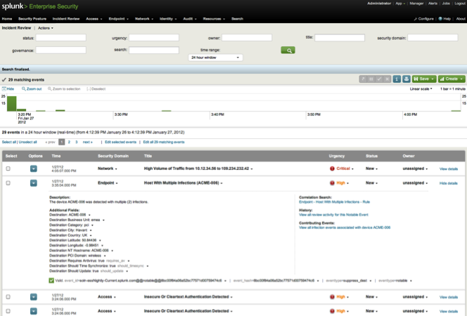
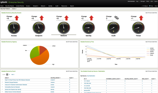
Splunk is a general tool for analysing data in huge IT infrastructures. It consists of different tools that can be utilized in different contexts. With the “Splunk App for Enterprise Security” potential threats and security incidents can be observed, analysed and classified. Users of the app are presented with a web dashboard that visualizes different aspects of the network.

Tags: , , , , , , , , , ,

ACARM WUI

ACARM_Heatmap

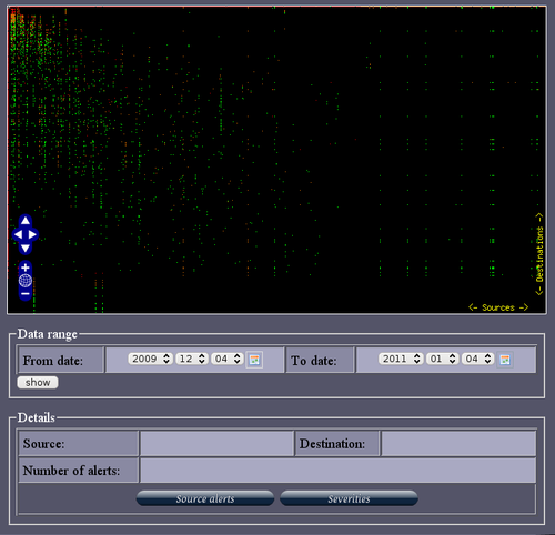
ACARM (Alert Correlation, Assessment and Reaction Module) is a tool that correlates alerts sent by host and network sensors into groups and in that way reducing the amount of messages that need to be viewed by a sytem administrator. There is a Web GUI that let’s the admin observe the different kinds of alerts with different graphical representations like, for example, pie charts, bar charts or more advanced. Different kinds of alerts are color coded on a color scale from green to red, green being just information, while red being critical.

Tags: , , , , , , , ,