SaSER Visualization Workshop

_MG_1753_MG_1811


Last week we hosted a workshop on the grounds of the TU Munich to gather people from different backgrounds in network security and network operation and create an opportunity to think about new ways of visualizing data in security monitoring and analysis. We gained a lot of insights from this workshop that we are processing at the moment. We will use these together with insights from interviews, use cases provided by our partners and other insights to fire up our design process. We can already say the workshop has been a great success and we are eager to instill our newly won knowledge into visualization concepts!
Among the participants were general security experts directly working in the security work package with us in the SaSER project, like Nokia Siemens Networks, the TU Munich, the RUB (Ruhr University Bochum), the Fraunhofer AISEC or participants involved in other work packages of SaSER, like the Leibniz Supercomputing Centre. There were two students working in security monitoring at the Leibniz Rechenzentrum who were able to share their expertise in this area. We also had two guests who came all the way from Finland to take part in the workshop! They are part of the Finnish research institute VTT, comparable to the German Fraunhofer institutes.

After a short introduction round and a little warm-up exercise (People had to visualize their spendings of the last week with pen and paper and present it), Johannes gave an overview over the most important insights so far from extracted from the interviews we conducted. We had a little discussion afterwards. Main topics here were: How to evaluate security level, how to select what data to share to cooperate with other stakeholders and how to cope with large amounts of data.
After that I gave a quick overview over state-of-the-art visualizations that we found interesting for the research project for different reasons. This talk was followed by a discussion as well. The main topics here were: Filtering as an essential means for visualization to focus on a subset of data, how to visualize security metrics and decision/attack trees and how to report security stati to other stakeholders via visualizations. These topics were further investigated especially in the afternoon sessions.
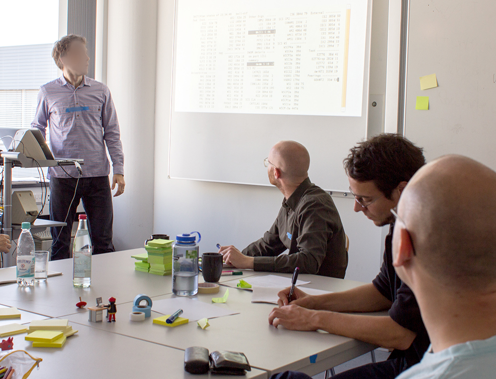
As a last task before the lunch break we asked the participants to come up with the perfect machine that could handle all of the network security or administration tasks they considered important, the so-called “Utopian Machines”. For this the participants got together in groups of two and had 20 minutes to develop an idea. After that each group presented their idea quickly.

tum-workshop-outcomes_10
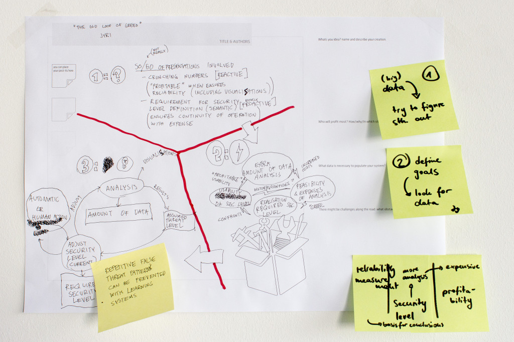
Results from the “Dashboard Kitchen” track

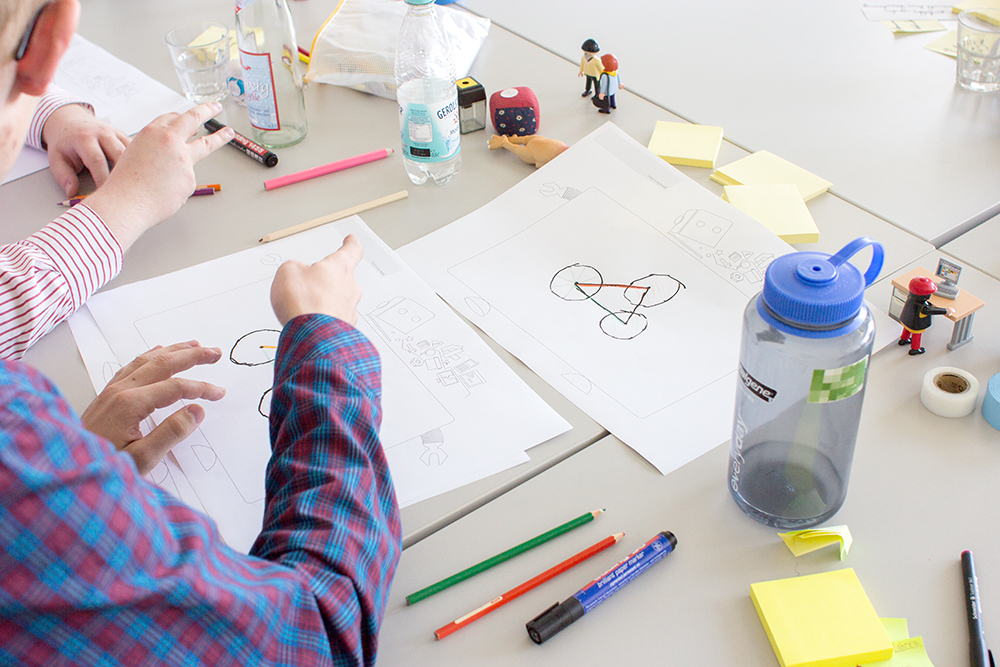
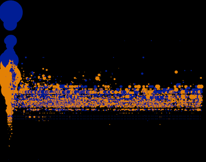
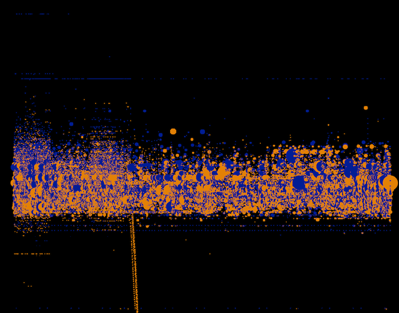
In the afternoon sessions there were two different tracks. One was called “Dashboard Kitchen”, the other “Data Picnic”. In the “Dashboard Kitchen” track people could either adjust their raw concepts from the “Utopian Machines”-session or come up with a completely new concept for a dashboard. In the “Data Picnic”-group we were looking at actual datasets that were relevant for security analysis. We talked about established workflows that are used to find out if there are particular incidents in the data and how visualization might assist in finding them more easily/efficiently. This was quite eye-opening for us because we haven’t been able so far to gain insight into the typical use cases security analysts are running through. Also, the “Dashboard Kitchen” results provided us with lots of different insights regarding the questions mentioned at the beginning as well as other issues.

_MG_1869
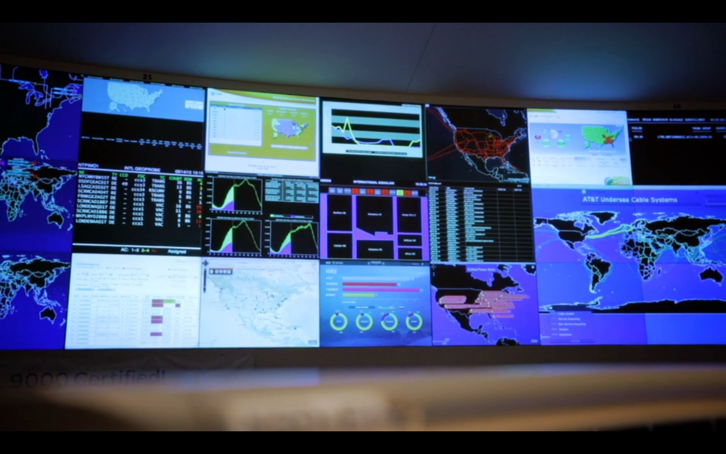
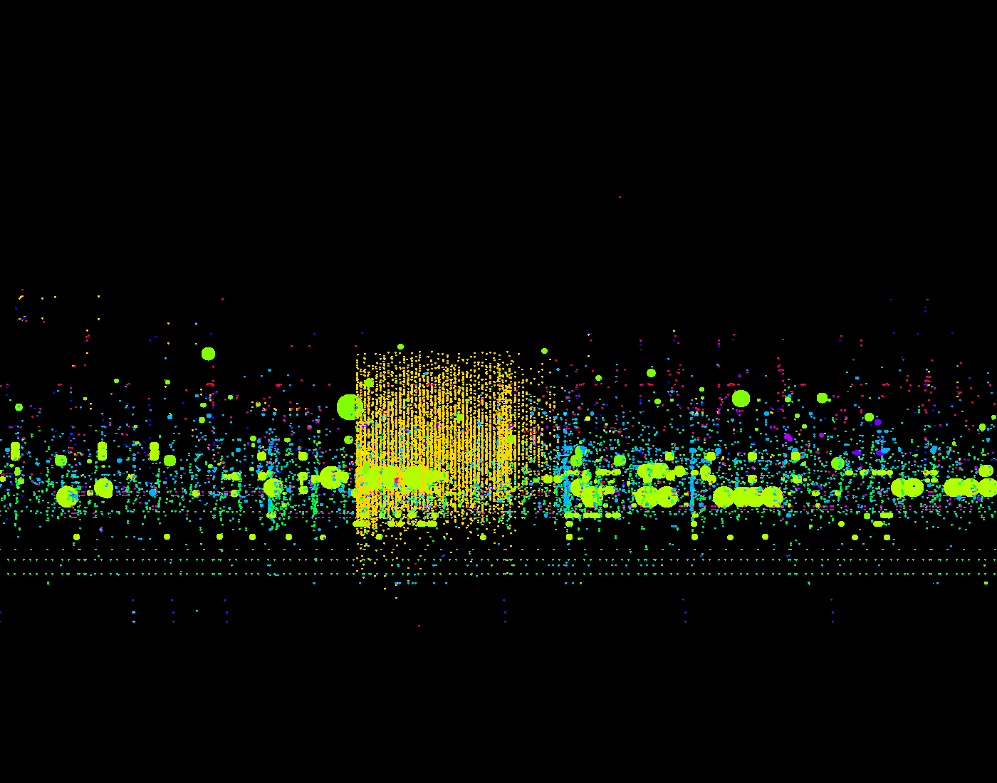
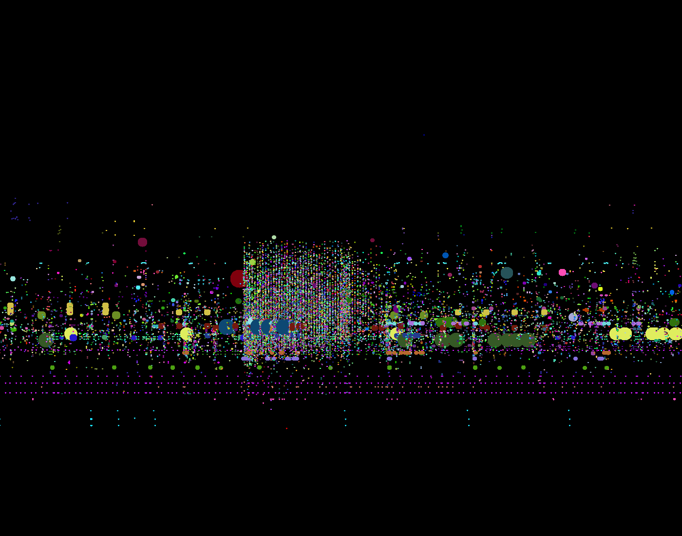
Analyzing a dataset together with security experts.

The results of the workshop will be documented in more detail on this blog soon, when we’re finished with the “post-processing”.
Thanks again to all participants for taking part and bringing so much commitment to the workshop, special thanks to Lothar Braun and the TUM for letting us use their seminar rooms!

Tags: , , , , ,

Code Red Visualisations

Code Red was a computer worm observed on the internet in July 2001. On the 12th of the month the malware program began to replicated itself to spread to other computers through networks of Microsoft’s IIS web-server. Once a system got attacked the worm checked the system clock of the machine, if the date was between the 1st and the 19th of the month code red generated a random list of IP addresses from a static seed and infected the machines of those IP addresses. From the 20th to the 28th of the month the worm started a Denial-of-Service attack against the website whitehouse.gov. Through a research project at the Interaction Design Laboratories at the University of Applied Sciences Potsdam we tried to find different visualization formats to develop a better understanding of the worm.

Autonomous System Network

Visualisation of 15.000 attacked Autonomous Systems and their connections to each other during the Code Red epidemic. The connectivity of the links is represented by their colour and size. Magenta nodes are only rawly connected. Blue nodes are highly connected autonomous systems also called “hubs”. The connectedness of a node is measured in degrees, how many links do refer and go out from each node. The most attacked node is a not too well connected system within the network, an AS from the Korean Telecom which received 13.835 attacks. It is coloured green within the network. The two most connected nodes are UUNET which was one of the largest Internet providers in the United States it got attacked 10.767 times. And the most connected link toplink GmbH a german VoIP provider which only got attacked 34 times. In many network systems like cells or diseases epidemics spread through the hubs of a system and by doing so also affect those the most. In the chase of code red this can’t be said.

Attacks Radial

All attacks mapped by time and their location in latitude and longitude on a radial layout. Each point represents one attack and the time when it got attacked. The nodes are coloured in by the length of the attack, from red if the system was only attacked for seconds up to 30 hours in blue. All countries with more than 4.000 attacks are mapped around the radial layout by their longitude.

Attacks Timeline

All attacks mapped by time and Autonomous system. The same dataset as the Attacks-Radial-Lat-Lon-Time this time not radial but on a coordinate system. What’s interesting here are the different interpretations we can make from the two datasets. While it becomes clear were the attacks go in the radial version, in this version the anomalies at 17h become much more clearer as well as the abrupt end of the worm after 24h.

Autonomous System Hiveplot

Actually this graphic is not really readable and there are other forms to visualize Autonomous Systems Networks that are more helpful. But in two instances the structuring of the nodes can help to develop an understanding of the network. First it shows how much bigger the two biggest nodes are in the network compared to the rest and it shows the long tail there are a large amount of nodes with only one connection and very little nodes with more than that. This kind of network is very easy to attack and epidemics can spread very quickly.

“Potsdamer Konferenz für Nationale Cybersicherheit”

On Tuesday, 4th of June, the “Potsdamer Konferenz für nationale Cybersicherheit” took place at the Hasso-Plattner Institute in Potsdam, Germany. The main goal of the conference was to improve the communication between the government, economy and the different research fields in the issue of cyber-security. For us, it was interesting in two ways: finding the main actors to focus on in our research and learning how the current security situation is rated by the different organisations.

hpi

 The conference started with a few words of welcome from Director and CEO of the Hasso-Plattner Institute, Prof. Dr. Christoph Meinel. In his short Keynote, which was mostly about the work and research of the HPI IT-Security Engineering Team, he also introduced the audience to the new HPI-Vulnerability-Database.

The HPI-VDB portal is the result of research work being conducted by IT-Security Engineering Team at Prof. Christoph Meinel’s chair “Internet Technologies and Systems” at HPI. It is a comprehensive and up-to-date repository which contains a large number of known vulnerabilities of Software. The vulnerability information being gathered from Internet is evaluated, normalized, and centralized in the high performance database. The textual descriptions about each vulnerability entry are grabbed from the public portals of other vulnerability databases, software vendors, as well as many relevant public web pages, etc. A well-structured data model is used to host all pieces of information which is related to the specific vulnerability entry. Thanks to the high quality data serialized in the high performance In-Memory database, many fancy services can be provided, including browsing, searching, self-diagnosis, Attack Graph (AG), etc. Additionally, we offer many types of API for IT developers to leverage our database for their development. (http://www.hpi.uni-potsdam.de/meinel/security_tech/hpi_vdb.html)

panel

A lot more interesting speakers have been invited to talk from their perspective of cyber security. For example the director of the European Network and Information Security Agency (ENISA) Prof. Udo Helmbrecht made a keynote speech addressed to policy- and decision-makers such as the Bundesland Brandenburg-Ministerpräsident, the Federal Minister, as well as industry representatives and others.

In Focus of our research, this conference was not the very best place to lern new things. But the possibility to make new contacts and meet interesting people in generell was great and we now have a few names to work with in the future time. Also the knowledge of the actors and so called: “big player” in the business is good to have.

A short film about the conference was uploaded on youtube. This video was made by hpi tv and sums up the conference pretty well. (GER only)

Tags: , , ,

Inside AT&T Network Operation Center

Every time we go online, make a phone call, send an SMS, we use the networks of large operators. These are large technical constructions and they need permanent monitoring and maintenance to work as we expect (which is: we don’t notice they are even there).

Network Operations Centers (NOC) are the institutions where network operators concentrate experts and technology to permanently check parameters of the networks, fix problems, and detect malfunctions and malware. Through their unique position, these NOCs are usually heavily shielded from the outside world.

This video gives a short insight into the Global NOC of AT&T (Bedminster, NJ), including a glimpse on their visualisations and an interview with Chuck Kerschner (Director of Network Operations at AT&T).

Friedmann and Kerschner in front of the video wall of the AT&T GNOC (click image for video)Friedmann and Kerschner in front of the video wall of the AT&T GNOC

Although Lex Friedman of TechHive asks the “right questions” (i.e. the questions we have as well), the answers are often a bit short and too general to learn a lot from them. Still, an interesting video for inspiration.

View on the large shared dashboard at AT&T (in the video at 1:20)View on the large shared dashboard at AT&T (in the video at 1:20)

A little more detais are availble here as audio, and in an WSJ article about a specialist working at AT&T to prepare for unusual traffic spikes.

Even closer to the SASER/Siegfried project are (Information) Security Operations Centers (SOCs) – note that Kerschner is mostly concerned with storms or technical outages, not with security threats like viruses or botnets. Steve Roderick is the colleague at the AT&T center responsible for security.


Tags: , , , , ,

Visualizing a day of financial transactions on NASDAQ

Design and technology studio Stamen visualized financial transactions of buy and sell data on NASDAQ during a single day.

What’s interesting about this visualization is the density of information that is captured within the dataset and the use of our pattern recognition capabilities to see repetitions and outliers of such a dense set of data.

http://content.stamen.com/visualizing_a_day_of_financial_transactions_on_nasdaq

http://content.stamen.com/visualizing_a_day_of_financial_transactions_on_nasdaq_part_2

For each transaction they mapped:

  • time of the transaction, to the second
  • whether it was buy or sell
  • price of the transaction
  • number of shares traded

Each image represents one minute in time and shows every trade that happens within the timeframe.

Each trade is shown as a circle:

  • Every vertical row is a second in time. So the left hand side of the screen is the beginning of the minute, the middle of the screen is 15 seconds in, and the right hand side of the screen is the end of the minute, with 60 seconds in between.
  • Blue dots are buys, yellow dots are sells
  • The vertical axis is the price of the transaction; the top of the screen is cheaper stocks and the bottom is more expensive stocks.
  • The size of the dot is the number of shares traded; small dots are for a few shares and larger dots are for a larger number of shares.

8:30-8:31 AM
log_minute_60_smThe images always show one minute of transaction. Bursts like this one at 8:30 become easily visible.


9:29-9:30 AM
log_minute_149_sm

Before trading opens for the public a dense wave of small transactions happens.


9:30-9:31 AM

log_minute_150_sm

Opening of the public trade creates a massive burst of activity.


In these visualizations a unique color represents each trader:

minute_515_4The orangish square above shows a single trader perform a burst of concentrated activity within precisely deliniated margins.

A unique color to represent each stock. The data is the same than in the image above. It becomes visible that the single trader trades a wide range of small stocks.

minute_515_4-1

Packetloop

Packetloop is a tool to analyse network traffic through data visualization. It inspects every packet, conversation, protocol and file to find threats and variations from normal traffic. It doesn’t visualize live data rather it is build on file uploads. There are four different ways Packetloop represents the data, by threats, sessions, protocols and files by location. But so far only the threats visualization works.

Screen Shot 2013-05-27 at 6.03.00 PM Screen Shot 2013-05-30 at 11.26.02 AM

Google+ Ripples

Google+ Ripples is a visualization of the spread of public posts in the social network Google+. Signed-up members of Google+ can select any public post and have a look at the spread of the post through the network. Only reposts that are set to public are shown in this visualization, so the visualization doesn’t show the reposts of people in their private circles.
The selected post is shown in the middle of the visualization. Reposts are represented by circles labeled with the person’s name that shared the post. Arrows show which person shared which post. If a shared post is shared again, the shared’s post circle becomes bigger. The spread of a message over time can be observed by using the timeline slider at the bottom of the diagram. It is also possible to zoom into diagram, which becomes very helpful when looking at posts that were reposted a lot of times.
The circles have different colors assigned, though it is not clear to me, what these are expressing.

I think generally this is an interesting approach of visualizing “contagion” in a network. It clearly identifies people that are more “contagious” than other people, which could be explained by these people having more social ties in the social network, having something like a leadership role or it could just mean that these people’s friends are more interested in the topic than other people’s friends that didn’t reshare their post. The zoomable user interface is a good way of providing focus and context by interaction. It allows for quite large numbers of elements to be displayed hiding detail information when it is zoomed out, providing more and more information with every zoom-in step.
Some aspects of the interface are worth discussing: For example, why do the circles of reshared posts have to be that large taking away a lot of space? Posts that reshare a post don’t necessarily have to be inside the circle. Also the interface could show all the reposts including the privately shared without providing the name of the sharing person.

Tags: , , , , , , , ,

Stanford Dissertation Browser

Stanford-Dissertation-Browser-electrical-engineering-625x608The Stanford Dissertation Browser is an interactive tool to explore similarities between different fields of study at Stanford University by examining the language used in the different PhD publications. Fields of study are arranged around a circle with one field of study in the centre. For the subject in the centre similarities with other fields are shown by the distance to the centre. The closer the circles, the more common the language these fields share.

For example, if you select Electrical Engineering the field Computational Science will move close to the centre, which is not a big surprise. When selecting Music, however, Computational Science also moves very close to the centre. Something you might not expect, at least not to this degree. With a slider at the bottom different years can be selected. The different years are shown all the time in the diagram by very subtle grey circles, which display year and field of study, if you hover over them. In this way you get an overview over the distribution over time and can get more details by moving the timeline slider to select specific years.

This way of visualizing a network is similar to the method the research group Research on Complex Systems at Northwestern University used in their visualization of the structural change in the international flight network. In a similar manner, one particular node was put into focus, surrounding nodes being closer to this node when these two nodes were strongly connected by many links. The same ist the case with the different fields of study. The more words they share, the more connections or links are there between these fields, moving them closer together.

Tags: , , , , , , , ,

Visualizing connectivity of airports during Eyjafjallajökull eruption

Eyjafjalljökull2 The Engineering Sciences and Applied Mathematics department at Northwestern University hosts several research projects that deal with complex networks. One of these projects deals with the effect of the ash cloud covering Europe in April 2010 for several days. The reaearch group tried to shed light on the question in what way the event has changed the structure of the complex network that is formed by the flight connections by all the airports around the world. The way they did this was not by looking at the overall topology of the network, but rather by looking at single nodes, the different airports, and calculating their shortest-path length before and after the eruption. The shortest path doesn’t describe the geographical distance between two airports, but rather the connectivity between them. So the more flights occur between two airports, the shorter is its path.

These calculations are shown in a special kind of circular before-after diagrams with one particular airport in the centre of a red circle surrounded by dots that represent all the airports that are connected. It is not clear what exactly the red circle describes. According to the website it is the “approximate distance of the world from Atlanta”. However, it is clearly some kind of threshold. Looking at Atlanta airport before the event we can see that there are several airports within the red circle, mostly North-American, but also some big others like Frankfurt, London or Hongkong. After the event, however, these have been pushed out of the circle, while in general most of the other nodes have been pushed further away from the circle, thus increasing their shortest-path length.

Tags: , , , , , ,

Fighters in a Patent War

PatentWars
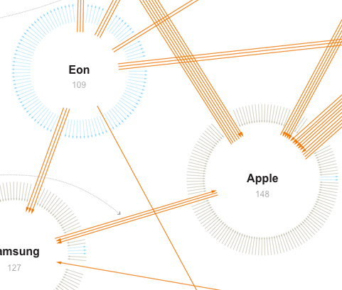
This network visualization by the New York Times shows patent suits of the ten biggest actors (like Apple, Samsung, Motorola etc.) in the mobile phone market. Suits between these ten companies are represented by orange arrows, while suits against one of the ten companies by other parties are colored grey and suits of one company against other parties have a blue color. These other parties are not more specifically detailed. The total amount of different arrows one company has are arranged in a circle with the effect that the cirle becomes bigger, the more incoming or outgoing suits one company has.

This visualization caught my attention primarily because of the arrangement of the arrows. Thinking of computer networks different segments of the circle could visually encode different ports and their connections in a network. Further research is needed to investigate, if this might prove helpful for security administrators.
Also, for such a visualization it might be more revealing to put more emphasis on the direction of the connections, e.g. by color. Differentiating the direction only by the little arrowhead, as we can observe in the New York Times graphic is a little hard to recognize. For applications such as monitoring a network these kinds of weak differentiations are not enough.

Tags: , , , , ,